Theme Editor Basics
The Shopify theme editor is where you customize Fit Check’s appearance, templates, sections, blocks, and global defaults. Start here when you need to understand what belongs in the page sidebar and what belongs in the gear-sidebar Theme settings.
Opening the Theme Editor
- In your Shopify admin, go to Online Store > Themes.
- Find Fit Check and click Customize.
Editor Layout
The theme editor has these main areas:
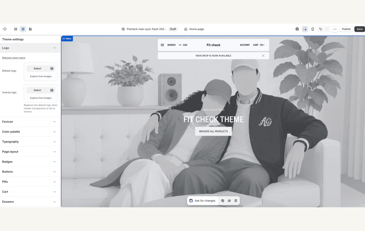
- Left sidebar — Lists the sections on the current template. Click a section to expand its settings and blocks.
- Center preview — Live preview of your store. Changes appear in real time as you adjust settings.
- Top bar — Switch between templates and preview resources, toggle between desktop and mobile preview, and undo or redo changes.
- Theme settings gear — Opens Fit Check’s global defaults for brand, typography, interaction controls, cart, search, variants, swatches, and shared overlay surfaces.
What To Edit Where
| Editor area | Use it for | Related docs |
|---|---|---|
| Theme settings gear | Store-wide defaults such as logo, favicon, palette, typography, page layout, buttons, inputs, badges, cart behavior, search behavior, drawers, modals, variant pickers, swatches, prices, gift card image, and social profile URLs. | Theme Settings |
| Template picker | Page-type setup for Home, Product, Collection, Search, Cart, Blog, Article, Page, Gift card, Password, customer-account, and 404 templates. | Templates |
| Section sidebar | Page areas such as Header, Footer, Hero Banner, Product Links, Featured product, Search page, Search grid mode, Product Recommendations, FAQ, Email, and Newsletter popup. | Sections |
| Blocks inside sections | Smaller composed items such as Container, Text, Image, Video, Button, Custom Liquid, Product item, Variant picker, Buy buttons, Quantity, Size guide, forms, accordion, and tabs. | Blocks |
| Reference docs | Data-source and asset requirements for product-card composition, product links, search/filter data, product metafields, Size Chart metaobjects, and image/video media. | Reference |
Working with Sections
Sections are the configurable areas on a template. Use them for visible page structure, merchandising, forms, media, recommendations, and template-owned experiences.
Add a Section
- Click Add section at the bottom of the left sidebar.
- Browse or search for the section you want.
- Click the section to add it to the page.
- Configure the section settings and add any required blocks before saving.
Reorder Sections
Drag and drop sections in the left sidebar to change their order on the page.
Remove a Section
- Click the section in the left sidebar to select it.
- Click the … menu next to the section name.
- Select Remove section.
Working with Blocks
Many sections contain blocks: individual content items or commerce controls inside the section. For example, product and featured-product layouts use blocks for product information, variant pickers, size guides, quantity, and buy buttons. Content sections use blocks for containers, text, images, video, buttons, forms, and custom Liquid.
Add a Block
- Click a section to expand it.
- Click Add block and select the block type.
- Fill in required content such as image, product, link, heading, or body text.
Reorder Blocks
Drag and drop blocks within the section to change their order.
Global Settings
Click Theme settings (gear icon) in the left sidebar to access global defaults that apply across Fit Check. Configure these before you tune individual templates, sections, and blocks so new page areas inherit the same brand and interaction system.
Upload the default and inverse logos used by headers and contrast-aware surfaces.
FaviconUpload the browser-tab icon for the storefront.
Color paletteSet the base Shopify palette that Fit Check uses for global background and foreground fallbacks.
TypographyChoose the five font slots and tune body, heading, badge, pill, and input text defaults.
Page layoutSet page background, border, shadow color, maximum width, spacing scale, and default shadow depth.
ButtonsConfigure Primary, Secondary, and Alternative button tiers, including color, typography, borders, radius, and padding.
Input fieldsTune input and checkbox colors, borders, radius, padding, and text style.
Social mediaAdd social profile URLs used by the Social links footer block.
Commerce And Interaction Settings
These Theme settings affect repeated commerce UI and interactive surfaces across templates.
Configure sale, sold-out, search-result, and custom collection badge appearance.
PricesChoose currency-code display across product pages, product items, cart items, and cart totals.
Variant pickersConfigure global text-option, selected-state, button-mode, underline-mode, and dropdown styling.
SwatchesConfigure global visual swatch images, sold-out indicators, size, radius, borders, opacity, and gap.
SearchChoose header search action, searchable resources, drawer text, recently viewed products, and search-result quick-add defaults.
CartChoose cart page or drawer behavior and configure cart panel, line items, empty state, notes, discounts, and checkout controls.
DrawersSet global drawer colors, borders, shadows, opacity, blur, and padding.
BackdropConfigure the overlay behind drawers and modals.
ModalsConfigure popover, quick-add, and modal panel colors, borders, shadows, opacity, and blur.
PillsConfigure pill and tag surfaces used by compact labels and filter-style UI.
IconsSet the global stroke width for Fit Check theme icons.
Gift cardUpload the replacement gift-card image used by the gift-card template.
Use the Theme Settings overview for the focused group pages, or the Full global settings reference when you need every global group in one place.
Global Versus Local Controls
Some controls look similar because Fit Check lets you set a strong global default and then override it where needed.
| Goal | Start with | Then tune |
|---|---|---|
| Build the storefront brand system | Logo, Favicon, Color palette, Typography, and Page layout. | Header, footer, section backgrounds, and template-specific layout choices. |
| Style product listing cards | Badges, Prices, Variant pickers, Swatches, Buttons, and Modals. | Product item block, Product-card blocks reference, collection/search/recommendation sections. |
| Configure search | Search, Drawers, Backdrop, Input fields, and Buttons. | Search template, Search page, Search grid mode, and search/filter data requirements. |
| Configure cart | Cart, Drawers, Backdrop, Prices, Input fields, and Buttons. | Cart template and cart page blocks. |
| Configure product purchasing | Variant pickers, Swatches, Prices, Buttons, Input fields, and Modals. | Product template, Variant picker, Buy buttons, Quantity, and Size guide. |
The /search page layout mode is configured on the Search template and Search page section, not in the gear-sidebar Theme settings. Global Search settings control the header search action, resources, drawer copy, recently viewed products, and quick-add defaults.
Recommended Setup Order
- Configure Logo, Favicon, Color palette, Typography, and Page layout.
- Configure Buttons, Input fields, Badges, Prices, Pills, and Icons.
- Configure Variant pickers, Swatches, Search, Cart, Drawers, Backdrop, and Modals.
- Add Gift card imagery and Social media URLs.
- Review the Home, Product, Collection, Search, and Cart templates on desktop and mobile.
Saving Changes
Click Save in the top-right corner to save your changes. Changes are not visible to customers until you save.
Before publishing a draft theme, use the top bar to review desktop and mobile previews for the home page, a product page, a collection page, the search page, and the cart. Check the main action on each route: navigation, product selection, add to cart, search results, cart updates, checkout handoff, forms, and drawer dismissal.