Cards
Display content in a responsive grid or carousel of cards. Common card item types include Feature, Review, Team, Milestone, and Location. Mixed custom-card sections can also use Container and Custom card composition. Lookbook grid adds an opinionated editorial layout of shoppable Look cards. Use this section family for testimonials, team introductions, feature highlights, company milestones, store locations, or styled product lineups.
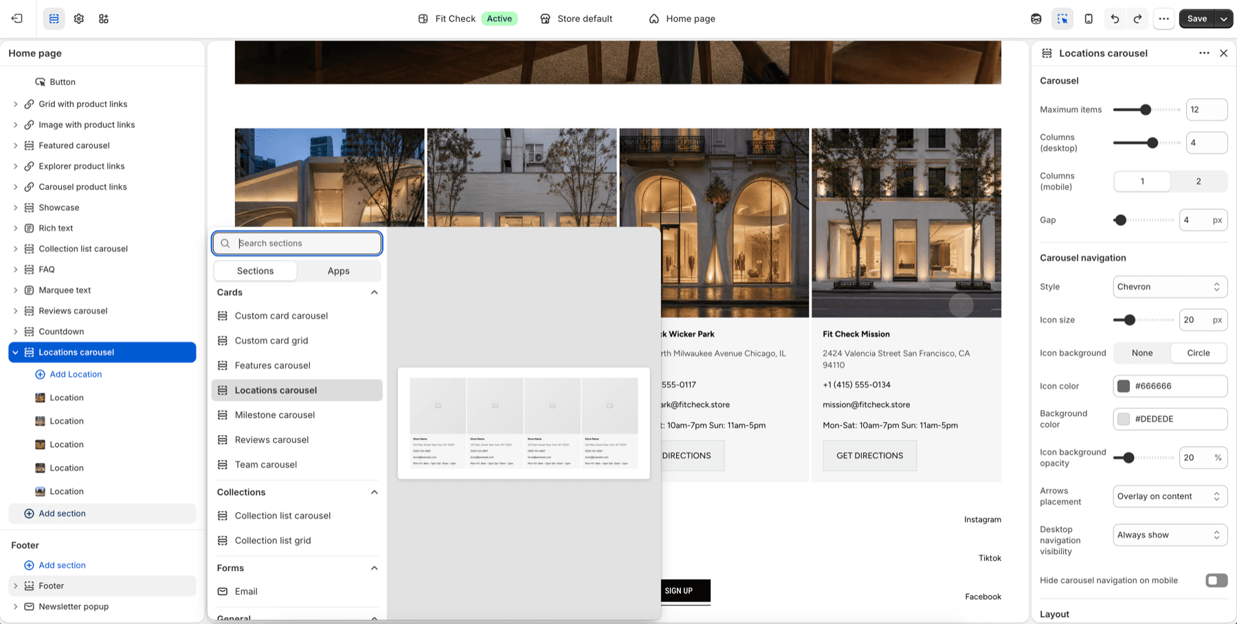
Configure the Section
- In the theme editor, click Add section.
- Select Custom card grid for mixed cards, Lookbook grid for an editorial shoppable lineup, or Locations carousel when the content is specifically store locations.
- Add blocks for each card type you want to display.
Section Settings
| Setting | Description |
|---|---|
| Max items | Maximum number of cards to display. Range: 1–24. Default: 12. |
| Desktop columns | Number of columns on desktop. Range: 1–6. Default: 4. |
| Mobile columns | 1 column or 2 columns. Default: 1. |
| Gap | Spacing between cards. Range: 0–100px. Default: 4px. |
| Section width | Page width or Full width. Default: Page width. |
| Background color | Set the cards section background or leave blank to inherit the global page background. |
| Padding | Use one all-sides value or set top, bottom, left, and right independently. Range: 0–100px. Default: 32px unified; 0px left/right in split mode. |
Lookbook Grid Defaults
Lookbook grid starts with six Look cards in three desktop columns and one mobile column. Its 32px gap, white surfaces, automatic media ratio, soft card shadows, and compact name/number caption rows create a fashion-lineup composition while remaining fully editable.
Each Look retains the complete Container settings for links, direction, mobile stacking, alignment, spacing, background blur, borders, shadows, desktop/mobile width, height, and padding. The starter composition uses white card surfaces, 16px padding on every side, and a shadow that remains visible on mobile without limiting later customization.
Each Look starts with Image with product links set to automatic aspect ratio and quick add. Product links appear as 12px underlined text below the media without product thumbnails or prices. Replace that block with Video with product links for motion, or adjust the nested Text and Container blocks to change the caption layout. The caption pairs a custom handwritten 20px look label with a right-aligned H4 number.
Block Types
Look
Build one editorial outfit, product story, or campaign frame. Look supports Image with product links, Video with product links, Text, Divider, and nested Container blocks. Card alignment, gap, surface color, border, corner radius, and all-sides padding are configurable.
Review Card
Choose a product once in Product link card. Set the optional Button’s Link destination to Same as product card to follow that card’s product or custom link automatically. New buttons use this mode; existing buttons retain Custom link and their saved URLs. Use exactly one Product link card per Review for automatic linking. With no valid destination or multiple product cards, the automatic button is hidden from shoppers; the editor keeps a disabled preview. Choose Custom link for an independent destination. A blank button label hides the button. View Product opens the product page; it does not add to cart.
Display a customer review or testimonial.
When a Review includes a Video block, media sits above a shared content panel. The Review background color, card padding and corner radius style that panel; content gap controls the spacing. Standard buttons fill its width, while custom buttons keep their width settings. Leave Use product card backgrounds off for an integrated product row, or turn it on to restore each Product link card’s own background, border, corners, padding and backdrop. Reviews without videos retain their original layout. See video review setup.
| Setting | Description |
|---|---|
| Rating | Star rating to display (1–5). |
| Star alignment | Horizontal alignment of the star rating — Left, Center, or Right. Independent of text alignment. Default: Left. |
| Star size | Size of the star icons. Range: 12–32px. Default: 16px. |
| Star color | Custom color for the star icons. Leave blank to use the theme color. |
| Review text | The review content. |
| Author | Reviewer name. |
| Author image | Optional photo of the reviewer. |
Feature Card
Highlight a product feature or benefit.
| Setting | Description |
|---|---|
| Image | Feature illustration or icon. |
| Title | Feature heading. |
| Description | Feature description text. |
Team Member Card
Introduce a team member.
| Setting | Description |
|---|---|
| Photo | Team member photo. |
| Name | Team member name. |
| Role | Job title or role. |
| Bio | Short biography. |
Milestone Card
Display a company statistic or achievement.
| Setting | Description |
|---|---|
| Number | The statistic value (e.g., “500+”). |
| Label | Description of the statistic (e.g., “Happy customers”). |
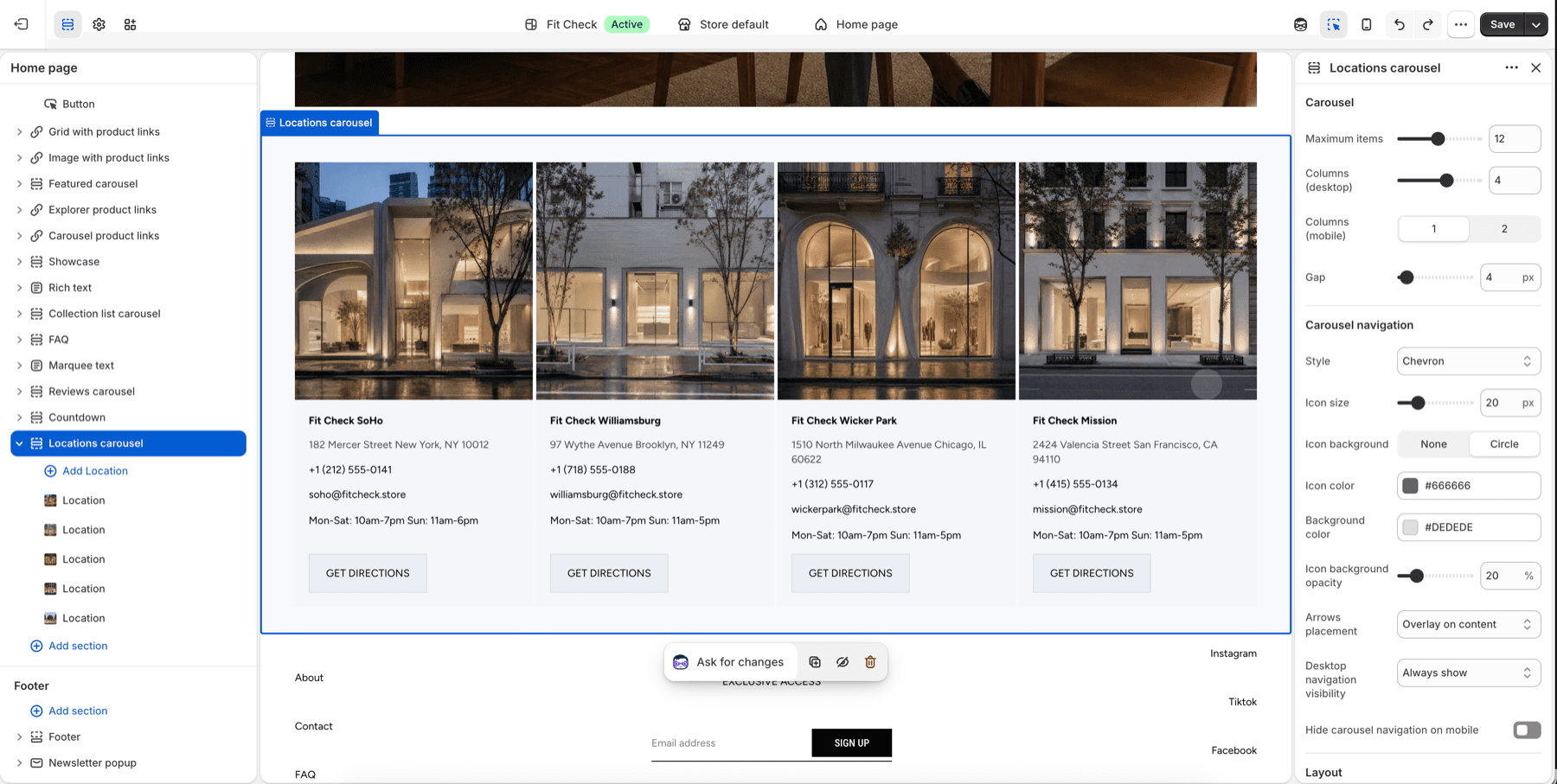
Location Card
Show a store or office location.
| Setting | Description |
|---|---|
| Image | Location photo. |
| Name | Location name. |
| Address | Street address. |
| Link | Link to map or location page. |