Announcement Slider
Display one or more rotating announcements at the top of your store. Use this section for shipping offers, product drops, sale messages, or short linked notices in the header group.
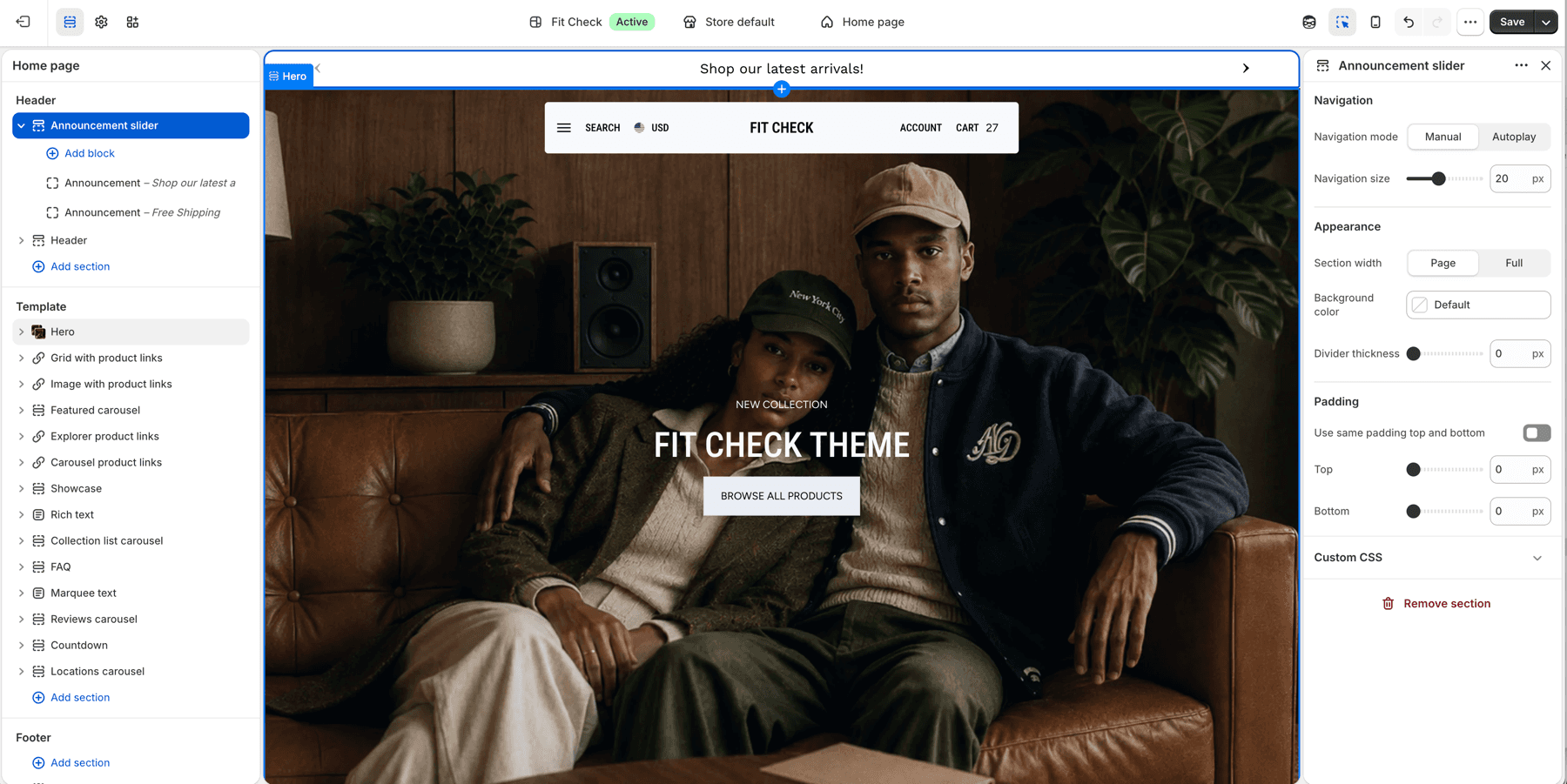
Configure the Section
- In the theme editor, click Add section in the header area.
- Select Announcement slider.
- Add one or more Announcement blocks.
- Use Manual navigation when customers should control multiple messages, or Autoplay when the bar should advance automatically.
Section Settings
| Setting | Description |
|---|---|
| Navigation mode | Manual navigation or autoplay. Default: Manual. |
| Navigation size | Size of the previous/next controls. Range: 12-32px. Default: 20px. |
| Time to next announcement | Time between slides when navigation mode is Autoplay. Range: 2-10 seconds. Default: 5s. |
| Section width | Choose Page width or Full width. Default: Page width. |
| Background color | Optional custom background. Leave Default to use the theme surface. |
| Divider thickness | Bottom divider thickness. Range: 0-5px. Default: 0px. |
| Use same padding top and bottom | Keep top and bottom spacing linked. Default: On. |
| Padding | Top and bottom padding when unified. Range: 0-100px. Default: 16px. |
| Top / Bottom | Independent padding controls when unified padding is off. Range: 0-100px. Default: 16px each. |
Blocks
Announcement Block
Add text announcements with optional links.
| Setting | Description |
|---|---|
| Text | The announcement message to display. |
| Link | Optional URL that makes the announcement clickable. |
When multiple announcement blocks are present, Manual mode shows previous/next controls and Autoplay mode advances using Time to next announcement.