Buttons
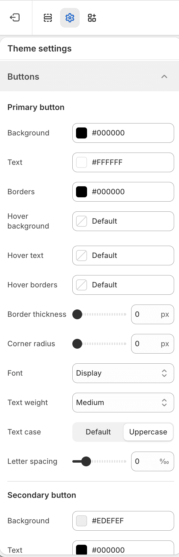
The Buttons Theme settings group controls Fit Check’s Primary, Secondary, and Alternative button tiers.
| Tier | Typical use |
|---|---|
| Primary | Main actions such as Add to cart, Checkout, Submit, and major calls to action. |
| Secondary | Supporting actions where the primary action should remain dominant. |
| Alternative | Intentional alternate styling for campaign or section-specific actions. |
Each tier includes direct background, text, border, and hover colors plus border width, radius, font slot, text weight, text case, and letter spacing. Shared button padding controls apply across all tiers.
Publish Checks
- Test product forms, checkout buttons, contact forms, newsletter signup, filters, search, and cart discount entry.
- Confirm long translated labels fit on mobile.