Product Card
Use this guide to style Product cards on collection, search, recommendation, complementary product, Featured grid, and Featured carousel surfaces. Fit Check separates the card into a parent Product card, a Product media block, a Product details group, and a Swatches group.
Start from a product listing surface that has real products assigned. Product card styling is easiest to judge when the preview includes products with images, prices, variants, and swatch data. Current Product cards start with a soft #f6f6f6 card background, Product media Arrows behavior enabled, hover-only carousel controls, chevron icons, no icon background, black carousel icons, and deterministic placeholder artwork for products without images.
Setup Order
- Open the card surfaceOpen the template or section that renders the cards, then select Product card in the theme editor sidebar.
- Set the parent cardUse the Product card settings for vertical gap, the default soft gray background, border, corner radius, and outer padding.
- Set media behaviorUse Product media for image ratio, media padding, Media behavior, hover-only controls, arrow/pagination styling, and quick-add icon styling.
- Arrange detailsUse Product details for the title and price group, then tune Product title and Product price alignment, typography, color, and padding.
- Set swatchesUse the Swatches group for row layout and surface styling, then use Product swatches for underline/button mode, swatch dimensions, alignment, and padding.
- Preview real statesCheck products with no image, long names, sale prices, multiple variants, single swatches, and mobile grid layouts before publishing.
Ownership Model
| Layer | Owns |
|---|---|
| Parent surface | Collection/search/recommendation/grid/carousel columns, card count, section spacing, filters, sorting, and parent carousel behavior. |
| Product card | Card-level vertical gap, background, border, radius, and outer padding around media, details, and swatches. |
| Product media | Product image ratio, media padding, static/hover/carousel Media behavior, hover-only controls, carousel icons, pagination, quick-add icon, and size selector styling. |
| Product details | The group that holds Product title, Product price, and optional nested content. It controls direction, alignment, gap, surface, size, shadow, and padding for that group. |
| Product title and Product price | Text width, alignment, mobile alignment, typography style, text color, and local padding. |
| Swatches | The group that holds Product swatches. It controls direction, alignment, gap, surface, size, shadow, and padding for the swatch area. |
| Product swatches | Hide-single-swatch behavior, underline/button style, custom swatch dimensions, desktop/mobile alignment, and local padding. |
| Shopify product data | Product images, variant images, product title, price, availability, options, variants, and saved swatch data. Products without images use Fit Check’s rotating product placeholder artwork. |
Use parent card settings for the whole tile. Use group settings when only the title/price row or swatch row needs its own layout. Use child block settings for the exact title, price, or swatch treatment.
Find The Product Card
On the collection template, the Product card is nested under Collection grid. Other product listing surfaces use the same Product item structure in their own section tree.
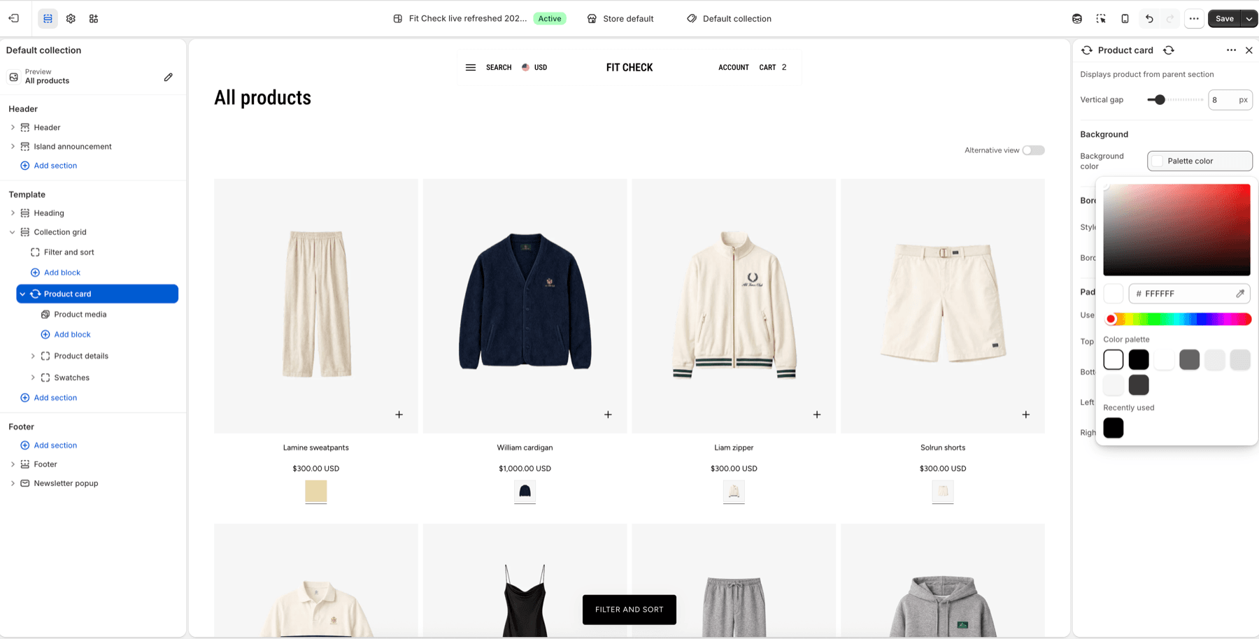
Set Background And Card Shell
Use Product card settings for the visible card shell.
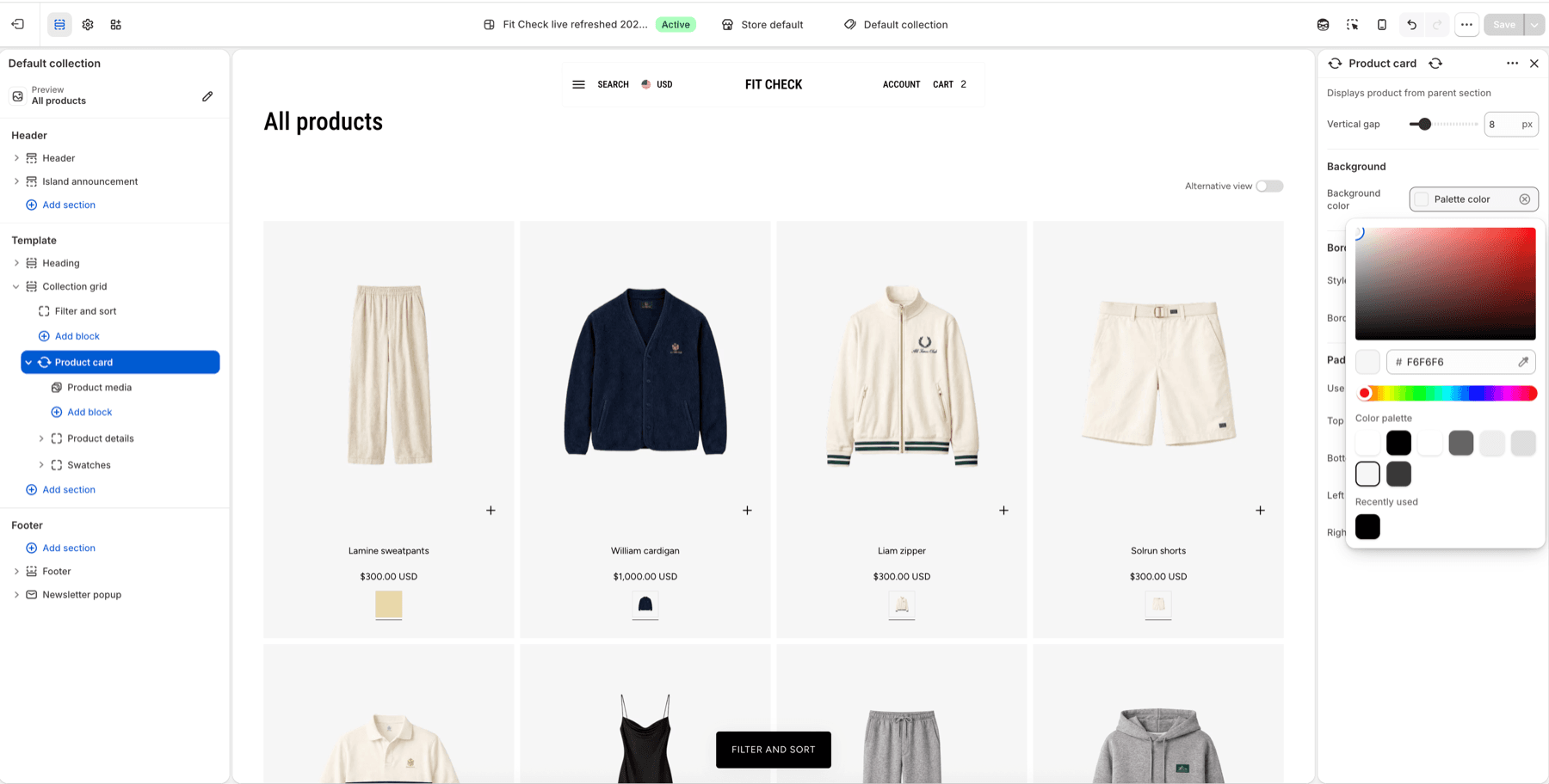
| Product card setting | Use it for |
|---|---|
| Vertical gap | Space between the media, details, and swatch groups inside the card. |
| Background color | A card-level surface behind the whole tile. The current default is #f6f6f6; choose another palette/direct color when the card needs stronger contrast or brand-specific treatment. |
| Border style | Add or remove the card border. |
| Border thickness and opacity | Tune border visibility when a border is enabled. |
| Border radius | Round or square the card shell. |
| Use same padding on all sides | Keep uniform card padding, or turn it off to set top, bottom, left, and right separately. |
| Top, bottom, left, right padding | Add outer space around all Product card content. Bottom padding is useful when swatches or quick add need more room. |
Use the parent card background when product images sit on transparent or very light media and the whole tile needs a consistent surface. If only the title/price group or swatches group needs contrast, use the group surface controls instead of changing the whole card.
Set Product Media
Select Product media to control the product image area.
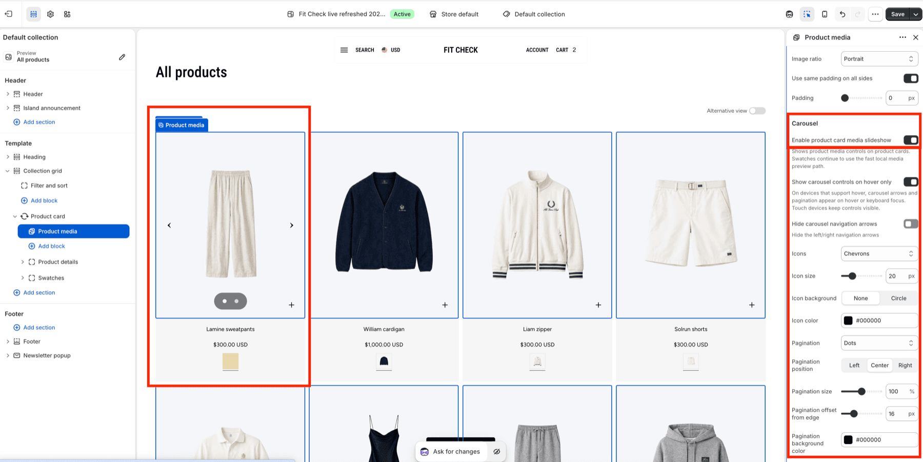
| Product media setting | Use it for |
|---|---|
| Image ratio | Choose Adapt to image, Portrait, Landscape, or Square for the product media frame. |
| Use same padding on all sides and Padding | Keep image padding uniform, or turn it off to set each side separately. Current Product media defaults to no image padding. |
| Media behavior | Choose Static image, Second image hover, Arrows, Pagination, or Arrows and pagination. Arrows are the current default for new Product media blocks. |
| Show carousel controls on hover only | Keep carousel controls quiet until hover or keyboard focus on pointer devices. Touch devices keep controls visible. |
| Icons | Choose Chevrons or Custom for arrow controls when Media behavior includes arrows. Chevrons are the default Fit Check treatment. |
| Icon size | Set arrow icon size. The current default is 20px. |
| Icon background | Choose no background or a circle behind arrow icons. The current default is None. |
| Icon color | Set arrow icon color. The current schema default is #000000. |
| Pagination, position, size, offset, background, text/dot color | Choose the card-level slideshow indicator style and placement. |
| Mobile pagination | Use a smaller mobile indicator treatment when desktop controls are too dense. |
| Enable quick add | Show quick add for this Product media block when global Product cards quick add is enabled. |
| Show sizes on hover and plus icon controls | Reveal inline size choices from the plus icon when enabled, then style the plus icon color, size, stroke, background, and position. |
Use Static image when listing cards should stay visually still. Use Second image hover for a quiet pointer-device preview. Use Arrows, Pagination, or Arrows and pagination when shoppers need explicit alternate-media navigation from the card; carousel behavior takes precedence over second-image hover. Swatches still use the fast local media preview path.
Products without images render a rotating set of Fit Check product placeholders by card position, so empty collection, search, recommendation, Featured grid, and Featured carousel states do not repeat the same placeholder on every card. Treat those placeholders as setup-safe fallbacks; replace them with real product media before launch when possible.
Set Product Details
Select Product details to control the group that contains Product title and Product price.
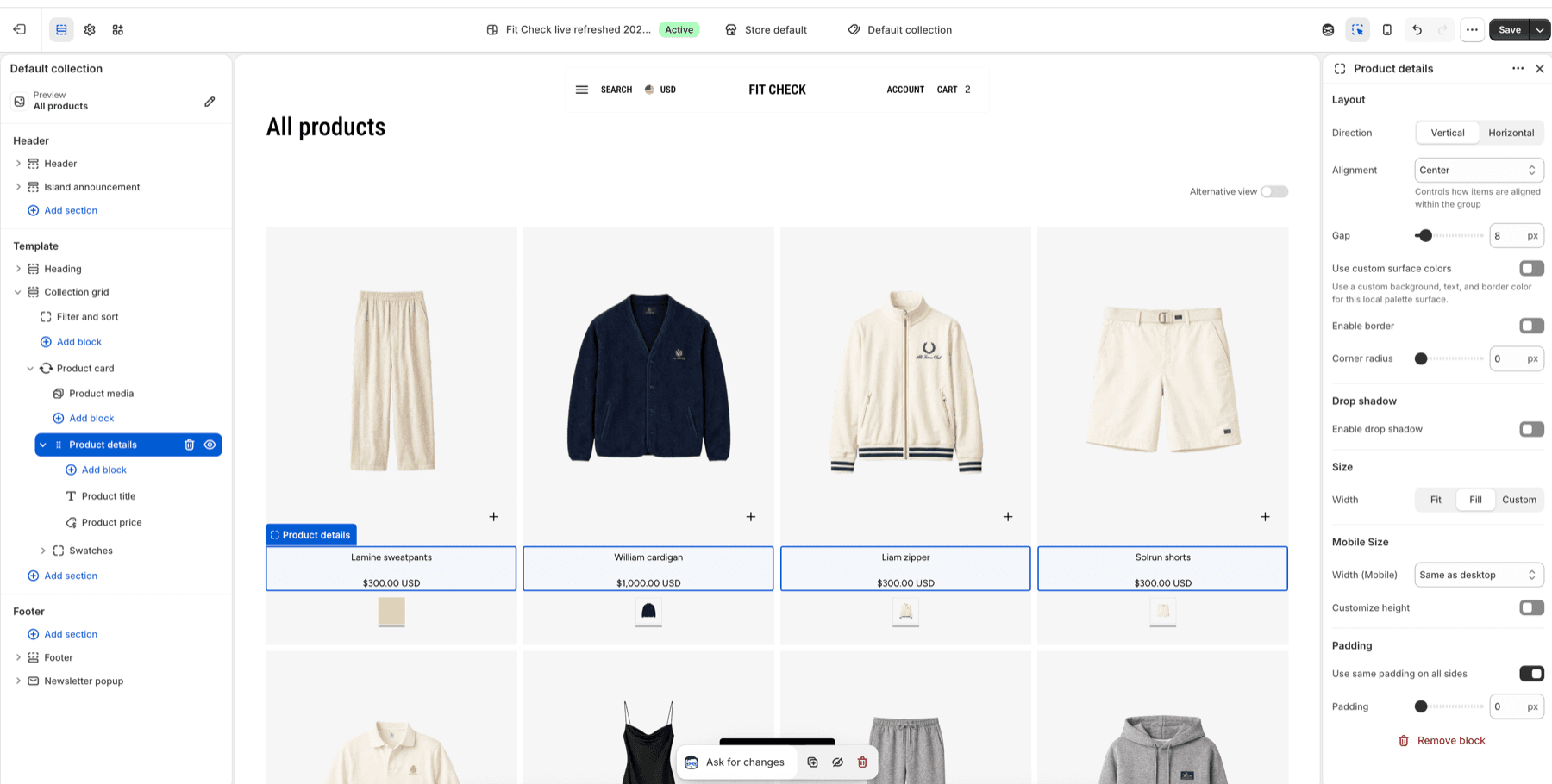
| Product details setting | Use it for |
|---|---|
| Direction | Stack title and price vertically, or place children horizontally. |
| Alignment | Align children within the details group. |
| Gap | Space between Product title, Product price, and any nested content. |
| Use custom surface colors | Give only the details group its own background/text/border color treatment. |
| Enable border and corner radius | Frame the details group independently from the parent card. |
| Enable drop shadow | Add separation when details sit on a custom surface. |
| Width and mobile width | Fit the group to content, fill the card, or use a custom width. |
| Customize height | Use only when details need a consistent panel height. |
| Padding | Add internal space around title and price as a group. |
Use Product details when the text stack needs more structure than the individual title or price blocks can provide.
Product Title
Select Product title for title-specific text controls.
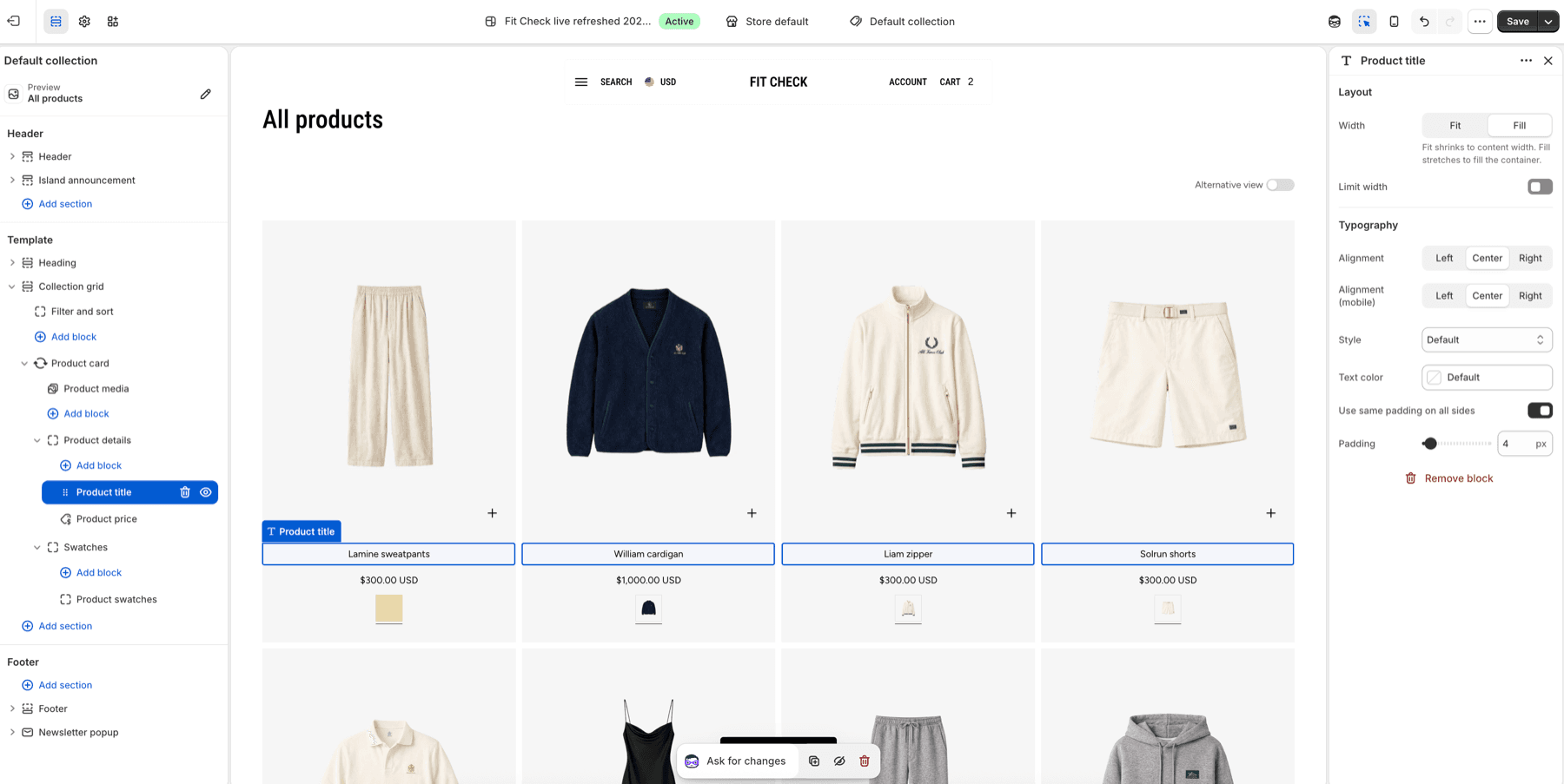
| Product title setting | Use it for |
|---|---|
| Width | Fit the title to text or fill the details group. |
| Limit width | Prevent long product names from stretching too wide on large cards. |
| Alignment and mobile alignment | Align title text independently on desktop and mobile. |
| Style | Use default body styling, heading styles, or custom typography. |
| Text color | Override only the title color. |
| Padding | Add title-specific spacing without moving price or swatches. |
Product Price
Select Product price for price-specific controls.
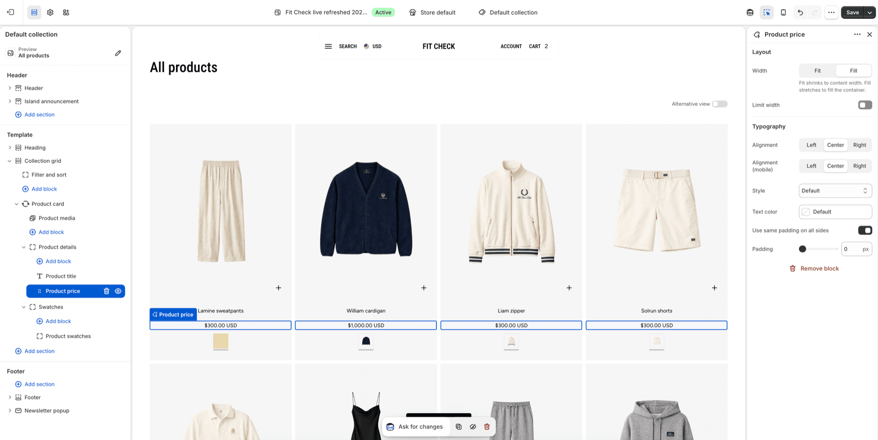
| Product price setting | Use it for |
|---|---|
| Width | Fit the price to content or fill the details group. |
| Limit width | Keep long sale/range prices from exceeding the card text area. |
| Alignment and mobile alignment | Align prices independently from title when needed. |
| Style | Keep default price text or use a heading/custom style. |
| Text color | Override only the price color. |
| Padding | Add price-specific spacing without moving title or swatches. |
Set Swatches
Select Swatches to control the group that contains Product swatches.
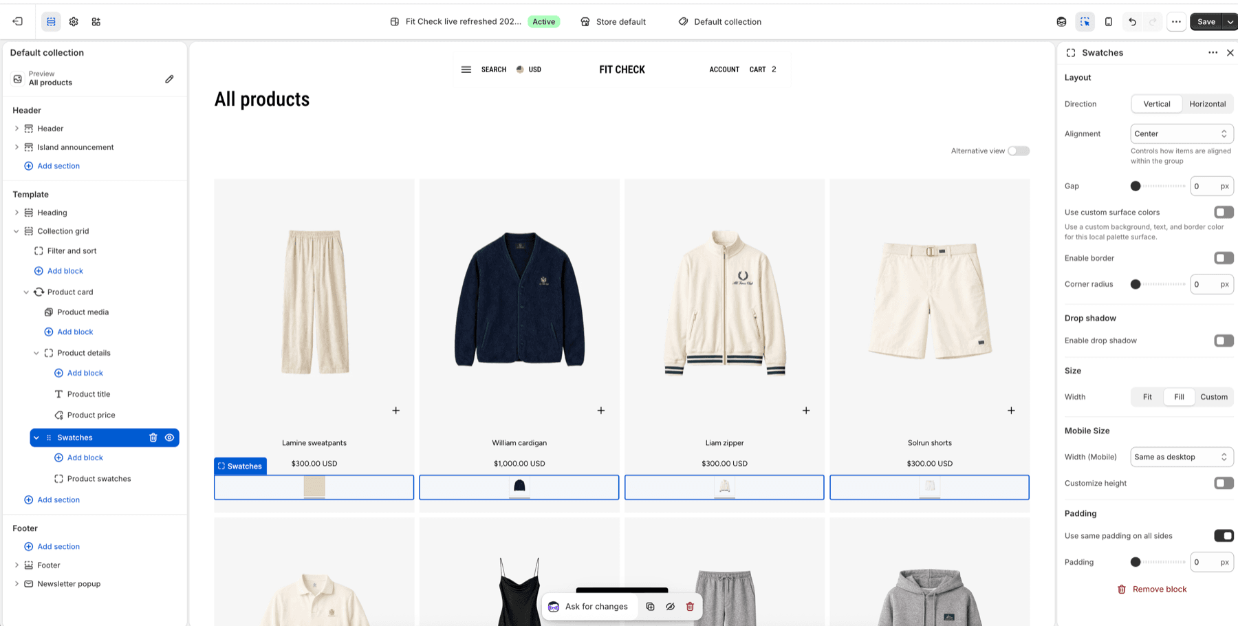
| Swatches group setting | Use it for |
|---|---|
| Direction | Stack or place nested swatch content horizontally. |
| Alignment | Align swatch content inside the group. |
| Gap | Space between nested swatch children if more than one is present. |
| Use custom surface colors | Give the swatch row its own surface color treatment. |
| Enable border, corner radius, and drop shadow | Frame the swatch row separately from media and details. |
| Width and mobile width | Fit, fill, or custom-size the swatch group. |
| Customize height | Reserve a consistent swatch row height when listing grids need even cards. |
| Padding | Add internal space around the swatch row. |
Then select Product swatches to control the actual swatch buttons.
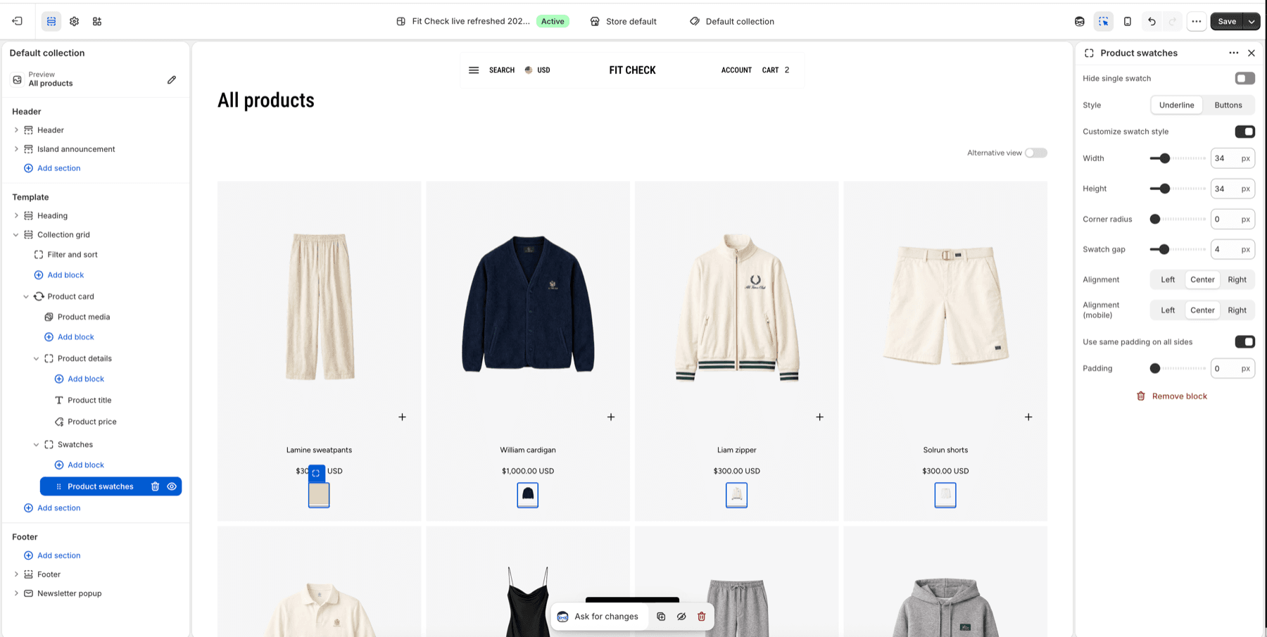
| Product swatches setting | Use it for |
|---|---|
| Hide single swatch | Hide the swatch row when only one swatch value would render. |
| Style | Choose Underline for compact media previews or Buttons for stronger tap targets. |
| Customize swatch style | Override the global swatch dimensions for this product-card surface. |
| Width and height | Set the card swatch size. |
| Corner radius | Make swatches square, softly rounded, or circular. |
| Swatch gap | Space individual swatches. |
| Alignment and mobile alignment | Align swatches independently on desktop and mobile. |
| Padding | Add space around the swatch controls themselves. |
Swatches depend on Shopify product option and swatch data. If no visual swatch data exists for a product option, Product swatches has no visual row to render for that option. Use the Variant Pickers and Swatches guide to check product data, global swatch behavior, and product-card swatch setup together.
Publish Checklist
| State | What to confirm |
|---|---|
| Default background | Cards remain readable on the default #f6f6f6 Product card background. |
| Custom background | Title, price, badges, swatches, quick add, and carousel controls have enough contrast on the selected card color. |
| Media ratio | Images remain consistently framed across no-image, portrait, square, and landscape product media. |
| No-image products | Placeholder artwork rotates across repeated cards and does not create broken images or empty media boxes. |
| Static image | Cards show one product image without hover or carousel controls. |
| Second-image hover | Products with a second media item preview it on hover when Media behavior is Second image hover. |
| Carousel media behavior | Arrow and pagination controls appear only when needed, remain keyboard/touch usable, and replace second-image hover when enabled. |
| Details group | Product title and price spacing stays stable with long names, sale prices, and range prices. |
| Swatches | Multi-option products show expected swatches, single-swatch hiding behaves as intended, and mobile swatches stay tappable. |
| Mobile grid | Card padding, text alignment, quick add, and swatches remain readable on narrow screens. |
Shopify Behavior
The Shopify theme editor lets merchants customize theme content and appearance and preview changes in real time. Fit Check exposes Product card controls through nested theme blocks and settings, so the card shell, media, details, title, price, swatches group, and Product swatches can be tuned independently.
References: