Color Palette
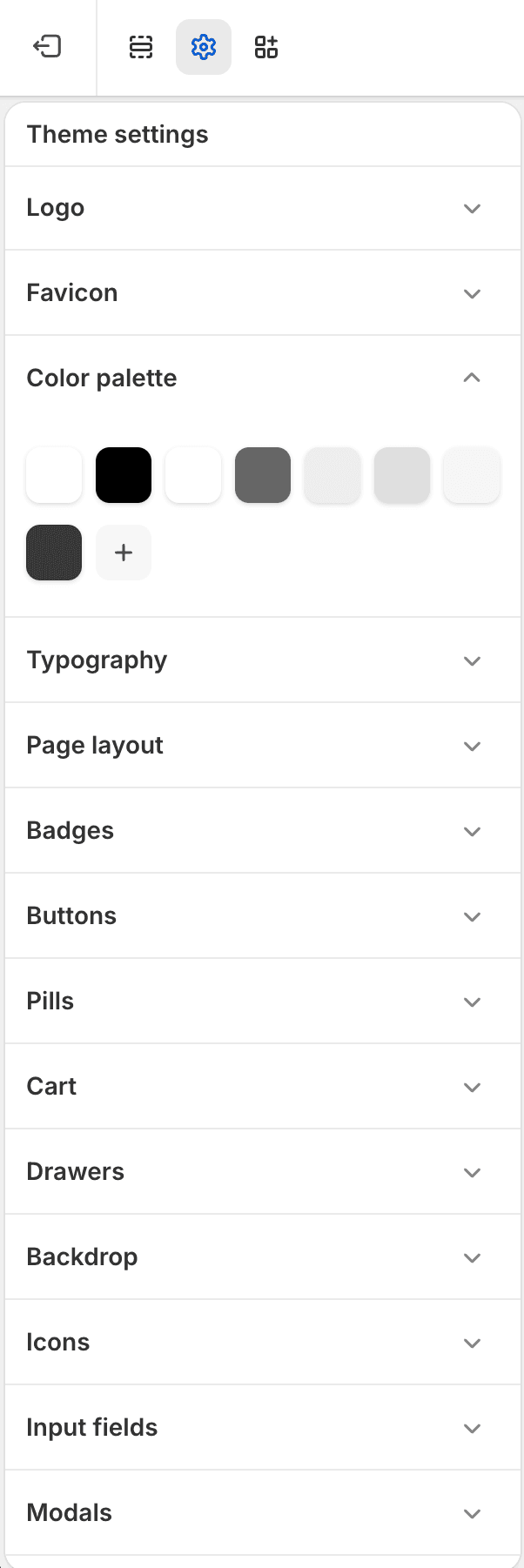
Fit Check uses Shopify’s Color palette setting as the base brand palette in the theme editor. Configure it before tuning page, section, block, and interaction colors.
For the step-by-step workflow with screenshots, use the Color palette guide.
What It Controls
The Color palette group stores reusable swatches. Color pickers elsewhere in the theme can use those swatches, or they can use a direct custom color for a local exception.
| Area | Use it for |
|---|---|
| Color palette | Reusable brand swatches for repeated backgrounds, foregrounds, neutrals, borders, and accents. |
| Typography colors | Page text, headings, primary text, and hover colors. |
| Page layout colors | Page background, borders, and shadows. |
| Buttons | Primary, secondary, and alternative button states. |
| Input fields | Input background, text, border, hover, and focus colors. |
| Badges and pills | Sale, sold-out, search-result, custom badge, and compact label colors. |
| Drawers and modals | Cart, search, quick-add, popup, and overlay panel colors. |
| Variant pickers | Variant, selected variant, hover, border, underline, and dropdown colors. |
Setup Notes
- Set the global Color palette before editing individual sections.
- Use palette colors for repeated surfaces that should follow the brand system.
- Use direct color controls only when a specific surface needs a deliberate one-off override.
- Leave section Background color fields blank when the section should inherit the page background and the setting allows blanks.
- Preview light and dark surfaces after changing button, input, drawer, modal, product-link, badge, and variant colors.