Collection Page
The collection template displays a filterable, sortable grid of products from a collection.
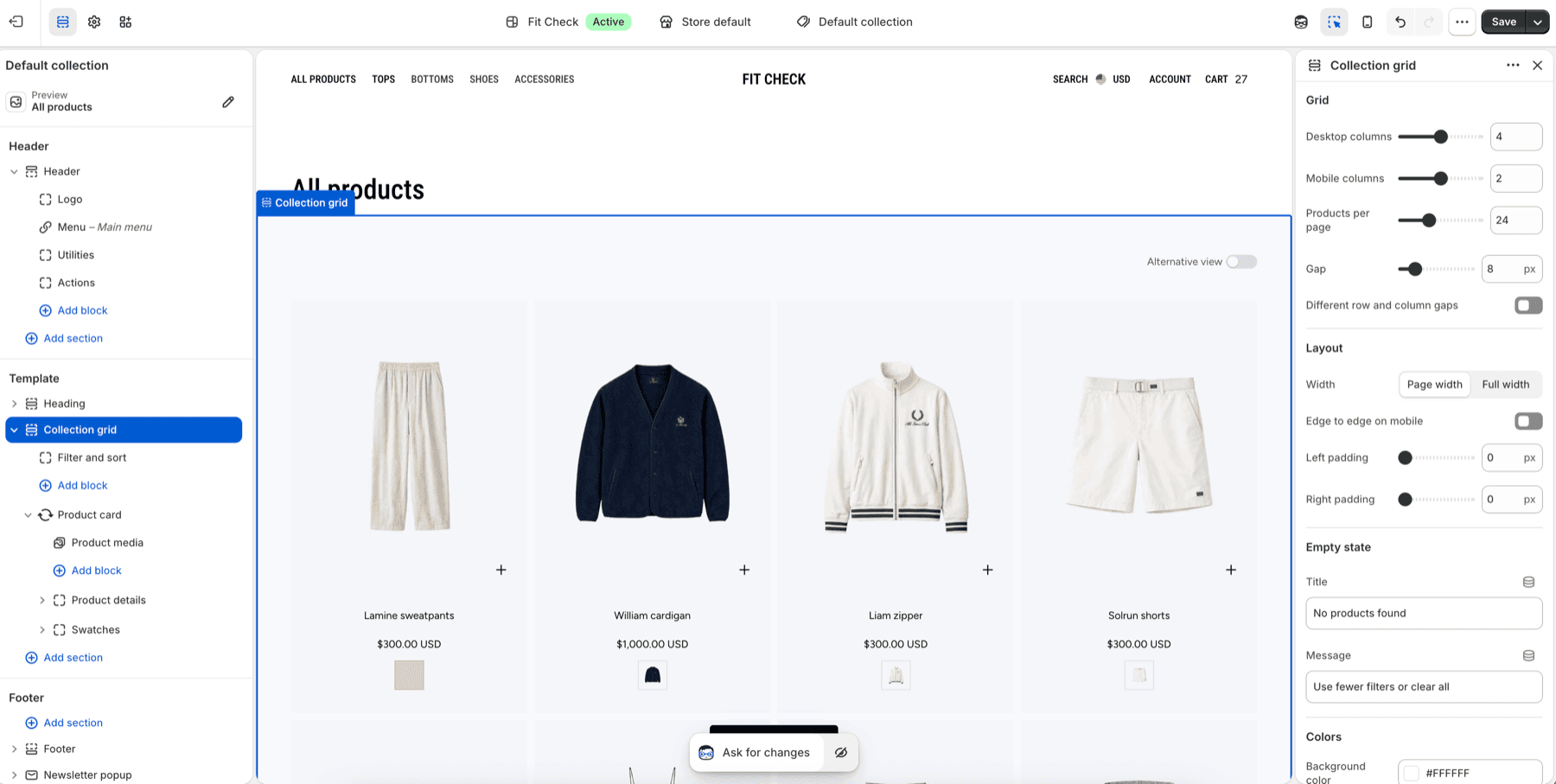
Setup Order
- Open the collection templateIn the theme editor top bar, switch to Collections and select the default collection template or a custom collection template.
- Choose a populated collectionPreview a collection with products so card media, titles, prices, swatches, filters, and pagination can be reviewed together.
- Configure the collection gridSet desktop columns, mobile columns, products per page, gap, page width, mobile edge-to-edge behavior, and section padding.
- Review filters and sortingUse the Filter and sort block with Shopify storefront filters, then test applying, clearing, and combining filters.
- Check product cardsReview product media, details, swatches, quick add, and empty-state copy on desktop and mobile.
Default Layout
The collection page features a product grid with built-in filtering and sorting controls.
Features
Product Grid
- Responsive columns (configurable for desktop and mobile)
- Customizable gap between product cards
- Product cards show image, title, price, badges, and variant swatches
Use Variant Pickers and Swatches for product-card swatch setup, global Swatches behavior, and Product page variant picker checks.
Filtering
Customers can filter products by:
- Color — Swatch-based color filters
- Size — Size option filters
- Price range — Min/max price slider
- Availability — In stock / out of stock
- Product type — Category filters
- Vendor — Brand/vendor filters
Filters use Shopify’s native Storefront Filtering API.
Sorting
Sort products by:
- Best selling
- Alphabetically (A–Z, Z–A)
- Price (low to high, high to low)
- Date (newest, oldest)
Pagination
Products are paginated with navigation controls at the bottom of the grid.
Section Settings
| Setting | Description |
|---|---|
| Products per page | Number of products shown per page. |
| Desktop columns | Grid columns on desktop. |
| Mobile columns | Grid columns on mobile. |
| Gap | Shared spacing between products. Enable different row and column gaps when the layout needs separate spacing values. |
| Width | Page width or full width. |
| Edge to edge on mobile | Removes side padding on mobile when the grid should use the full viewport width. |
| Left and right padding | Optional side padding for the grid container. |
| Empty state title and message | Text shown when a collection has no products or filtering returns no products. |
| Background color | Optional section background override. |
| Section padding | Use one all-sides value or set top, bottom, left, and right independently. This is separate from the grid container’s optional side padding above. |