Hotspot Media Pattern
Fit Check does not ship a standalone Hotspot image section. Instead, hotspot shopping is built with the Hotspot image block inside compatible layout sections.
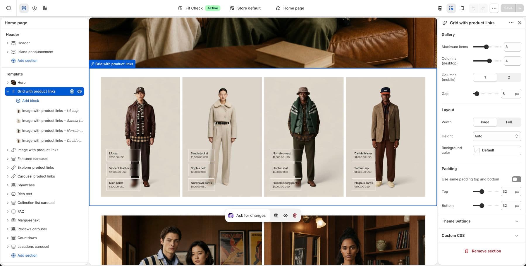
Where to Use It
- Section — Best for a single hotspot image or a custom mixed layout
- Multicolumn hotspots — Best for multiple hotspot images in one composed section
Set Up the Pattern
- In the theme editor, add either Section or Multicolumn hotspots.
- Inside that section, click Add block and choose Hotspot image.
- Upload the main image for the hotspot canvas.
- Enable each hotspot you want to use, place it with the X/Y controls, and assign a product.
- Adjust the popup styling, button label, and block padding as needed.
Hotspot Image Block Settings
| Setting group | Description |
|---|---|
| Image | Upload the main image and choose its aspect ratio: Auto, Portrait, Square, or Landscape. |
| Hotspot style | Control hotspot size plus the hotspot background and icon colors. |
| Popup style | Choose popup colors, popup width, product image size, and button label. |
| Hotspot slots | Configure up to 10 hotspots. Each slot has an enable toggle, horizontal position, vertical position, and linked product. |
| Padding | Control top, right, bottom, and left padding around the block. |
Behavior
- A hotspot pin only renders when that hotspot is enabled and a product is assigned.
- Clicking a hotspot opens a product panel with the linked product image, title, price, and CTA button.
- If no canvas image is uploaded yet, the block shows a neutral empty state in the editor so merchants can configure the block before adding final media.