Variant Pickers and Swatches
Use this guide to set up product variant pickers and swatches across product cards, quick-add surfaces, Featured product, and the Product template. Fit Check separates product option data, global variant styling, global swatch behavior, product-card swatch blocks, and the Product page Variant picker block.
Start with real product data. Swatches only appear when Shopify product option values have saved swatch color or image data. The global Swatches > Variant images setting can use representative variant media for those swatch-eligible option values, but it does not turn every media-backed option into a swatch by itself.
Setup Order
- Prepare product optionsIn Shopify admin, confirm products have useful option names, option values, variants, availability, variant media, and saved swatch data where visual swatches should appear.
- Set global Variant pickersUse Theme settings > Variant pickers for text option colors, selected states, button sizing, underline behavior, and dropdown appearance.
- Set global SwatchesUse Theme settings > Swatches for variant image behavior, sold-out indicators, swatch dimensions, shape, borders, and gap.
- Configure product-card swatchesOn collection, search, recommendation, and featured product-card surfaces, use the Product swatches block for card-level style, alignment, and padding.
- Configure the Product page pickerOn the Product template or Featured product section, use the Variant picker block for underline, buttons, dropdowns, labels, swatches, spacing, and padding.
- Preview real variant statesTest available, unavailable, sold-out, image-backed, color-backed, long-label, and mobile states before publishing.
Ownership Model
| Layer | Owns |
|---|---|
| Shopify product data | Option names, option values, variants, availability, saved swatch color/image data, variant media, and variant URLs. |
| Theme settings > Variant pickers | Text option colors, selected state colors, text option size, button style, underline style, and dropdown appearance. |
| Theme settings > Swatches | Variant image display, sold-out indicator, swatch width, height, radius, border, border opacity, and gap. |
| Product swatches block | Product-card swatch style, card-level swatch dimensions, alignment, mobile alignment, and padding. |
| Variant picker block | Product form picker mode, labels, swatches toggle, dropdown overrides, option gap, local text option sizing, underline swatch overrides, and padding. |
Use global settings when the decision should apply across the theme. Use block settings when one product-card surface or one product form needs a different layout.
Prepare Product Data
Variant pickers and swatches depend on the product, not just the theme settings.
In Shopify admin, open the product and confirm the option structure before you tune the theme. The example below has a Color option with Brown and Black values, a Size option with S, M, L, and XL values, grouped variant rows, product media for each color family, and availability shown at the variant level.
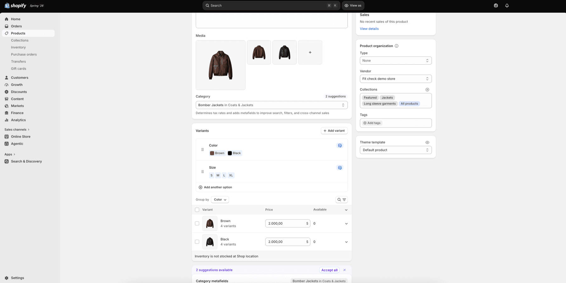
Use this admin check before troubleshooting theme settings:
- Option names decide what the customer sees as groups such as Color and Size.
- Option values decide which swatches, buttons, or dropdown choices can render.
- Variant media gives each color family a representative image when the theme is allowed to use variant images.
- Availability decides which combinations are selectable, unavailable, or sold out.
- Saved swatch data still needs to exist on the Shopify option value before Fit Check can render a true visual swatch.
| Product data | Why it matters |
|---|---|
| Option names | Drives labels such as Color, Size, Fit, Waist, or Length. |
| Option values | Drives buttons, dropdown choices, swatch labels, and URLs. |
| Saved swatch data | Lets Fit Check render a visual swatch for a product option value. |
| Variant media | Can become the swatch image when Variant images is enabled and the option value is already swatch-eligible. |
| Availability | Controls disabled and sold-out treatment for product option combinations. |
| Variant links | Lets product links open with a specific variant or option-value state selected. |
Use clear option names. For example, use Color for visual swatches and Size for text buttons. Avoid using a visual swatch for product data that customers need to read as text.
Style Global Variant Pickers
Open Theme settings > Variant pickers before tuning individual blocks. These controls set the global text option and dropdown system used by Product page forms and product-card variant controls.
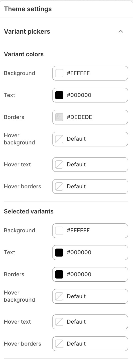
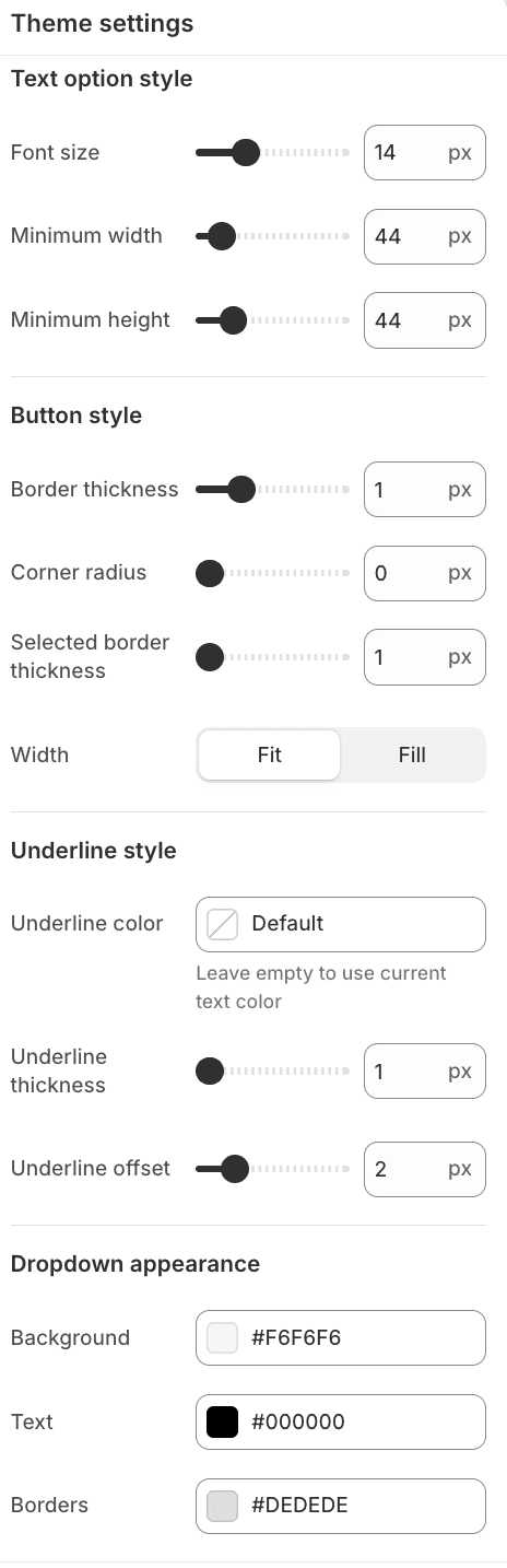
Use global Variant pickers settings for:
| Area | Use it for |
|---|---|
| Variant colors | Default background, text, border, and hover colors. |
| Selected variants | Selected background, text, border, and selected hover colors. |
| Text option style | Base font size and minimum button dimensions for size, fit, length, and similar text values. |
| Button style | Button border, radius, selected outline, and fit/fill width behavior. |
| Underline style | Global underline color, thickness, and offset. |
| Dropdown appearance | Dropdown background, text, and border colors. |
Style Global Swatches
Open Theme settings > Swatches for visual swatch behavior. This controls the shared swatch geometry and sold-out treatment used wherever swatches render.
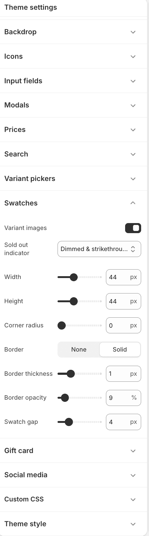
| Setting | Use it for |
|---|---|
| Variant images | Use representative variant media for swatch-eligible option values when variant media is available. |
| Sold out indicator | Choose how unavailable swatches are marked. |
| Width and height | Set the global visual swatch size. |
| Corner radius | Choose round, soft, or square swatches. |
| Border and border thickness | Keep light swatches visible on light backgrounds. |
| Border opacity | Tune how quiet or strong the swatch edge feels. |
| Swatch gap | Set spacing between swatches. |
Configure Product-Card Swatches
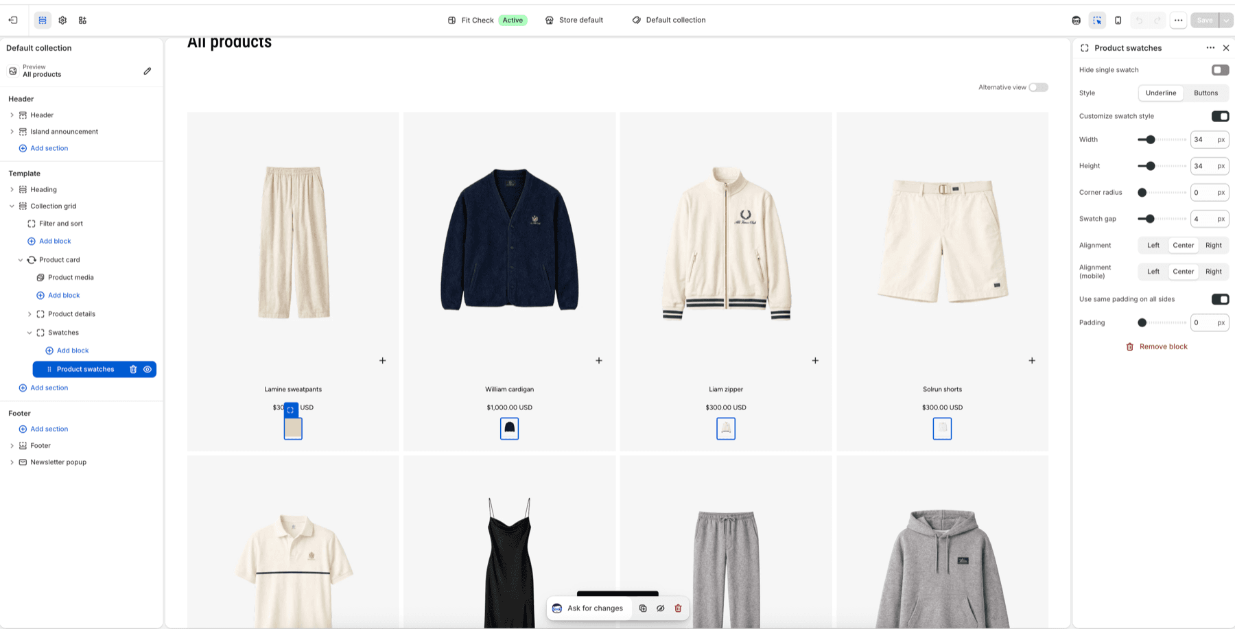
Use the Product swatches block inside Product card blocks on collection, search, recommendation, complementary product, Featured grid, and Featured carousel surfaces.
| Product swatches setting | Use it for |
|---|---|
| Hide single swatch | Hide the swatch row when only one swatch value would appear. |
| Style | Choose Underline or Buttons for the card swatch treatment. |
| Customize swatch style | Override card-level width, height, radius, and gap. |
| Alignment | Align swatches left, center, or right on desktop. |
| Alignment (mobile) | Keep mobile card rows aligned independently from desktop. |
| Padding | Add space around the swatch row inside the product card. |
If a product has no saved swatch data for an option, the Product swatches block has no visual swatch row to render for that option. Check the product data before assuming the block is misconfigured.
Configure The Product Page Variant Picker
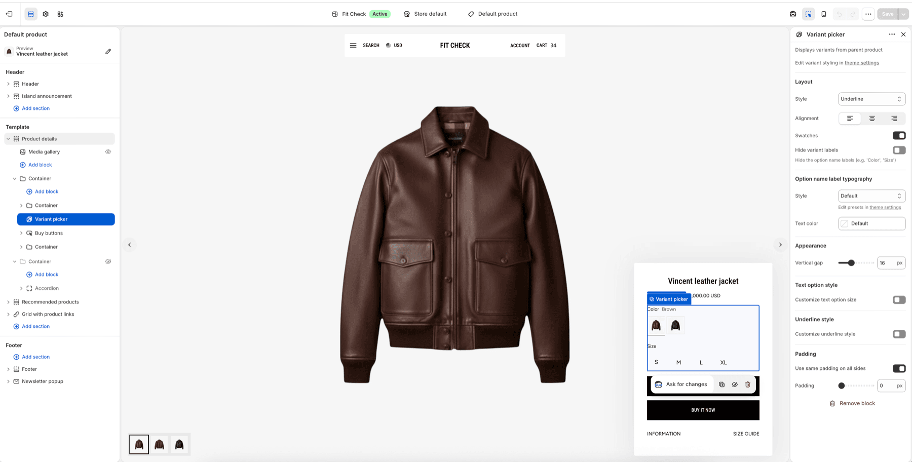
Use the Variant picker block inside Product details or Featured product forms. This block controls how the customer chooses options before adding to cart.
| Variant picker setting | Use it for |
|---|---|
| Style | Choose Underline, Buttons, or Dropdowns. |
| Alignment | Align option groups inside the product form. |
| Swatches | Show visual swatches for swatch-eligible option values. |
| Hide variant labels | Hide visible labels such as Color or Size while preserving accessible option names. |
| Option name label typography | Style the option labels when labels remain visible. |
| Vertical gap | Space option groups such as Color and Size. |
| Text option style | Override text option sizing for the current block. |
| Underline style | Override underline-mode swatch size and underline treatment for this block. |
| Padding | Space the picker relative to title, price, quantity, and buy buttons. |
Use Dropdowns when the option list is long. Use Buttons when text options need clear tap targets. Use Underline when the product form should stay compact and visual.
Publish Checklist
| State | What to confirm |
|---|---|
| Swatch data | Color option values with visual swatches have saved Shopify swatch data. |
| Variant images | When Variant images is enabled, image-backed swatches show the expected product media. |
| Text options | Size, fit, length, and other text values remain readable and tap-friendly. |
| Unavailable values | Sold-out and unavailable option states match the global sold-out indicator setting. |
| Product cards | Collection/search/recommendation cards show swatches without crowding title, price, badges, or quick add. |
| Product page | Variant selection updates media, price, availability, pickup, selling plans, and add-to-cart state. |
| Mobile | Swatches and text options stay readable, tappable, and aligned on narrow screens. |
| Long labels | Values such as Extra long, Washed black, or Limited edition do not overflow. |
Shopify Behavior
Shopify product variants are combinations of product options. Shopify recommends presenting each product option separately, then updating product media and price when customers choose a new variant. Product option values expose availability, saved swatch data, and associated variant data to the theme.
References: