Cart
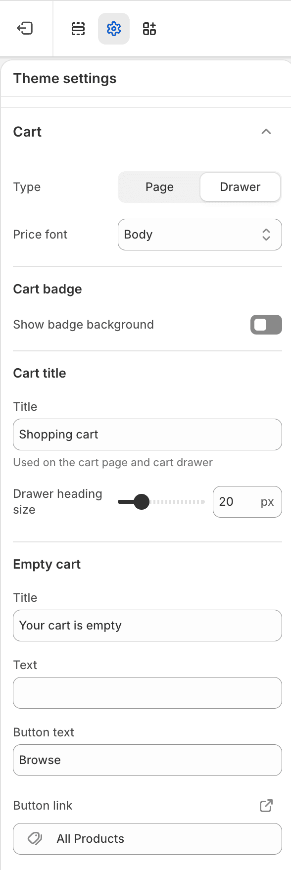
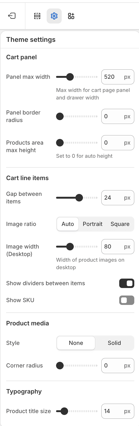
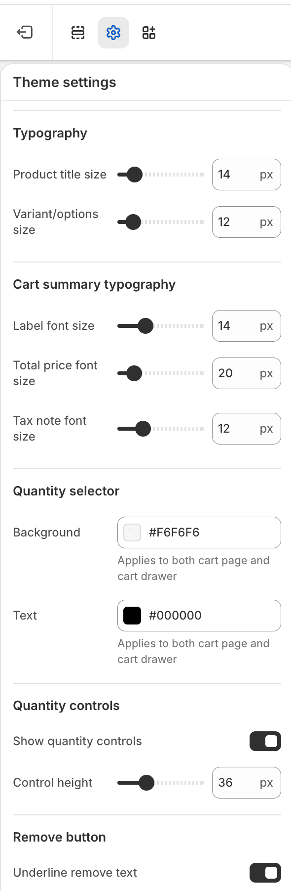
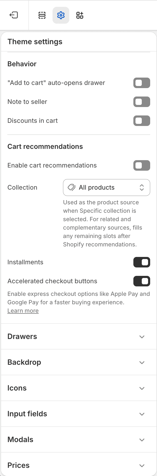
The Cart Theme settings group controls cart behavior, cart page/drawer content, line-item layout, cart recommendations, notes, discounts, installment messaging, and checkout controls.
| Area | Settings |
|---|---|
| Cart type and price | Cart type and cart price font. |
| Cart badge | Cart icon badge background visibility. |
| Cart title and empty state | Cart heading, drawer heading size, empty title, empty text, empty button text, and empty button link. |
| Cart panel | Panel max width, border radius, and products area max height. |
| Cart line items and media | Item gap, image ratio, desktop image width, dividers, SKU display, thumbnail border, and thumbnail radius. |
| Typography | Product title size, variant size, summary labels, total, and tax note. |
| Quantity controls | Quantity selector colors, control visibility, control height, and remove-link underline. |
| Behavior | Add-to-cart auto-open drawer, cart note, and discount code. |
| Cart recommendations and checkout | Enable recommendations, heading, source, fallback collection, card size, product count, installments, and accelerated checkout buttons. |
Ownership Notes
- Cart drawer panel width is a Cart setting.
- Generic drawer surface colors, border, shadow, opacity, blur, and padding are in Drawers.
- The overlay behind drawers is controlled by Backdrop.