Color Palette
Use this guide to set the global Color palette in Fit Check, then decide when a section or block should reuse a palette swatch and when it should use a one-off direct color.
Shopify exposes Color palette as a theme setting. Fit Check uses it as the base brand palette for reusable swatches, while direct color controls in Typography, Page layout, Buttons, Input fields, Badges, Drawers, Modals, Pills, Variant pickers, and many sections can either reference those swatches or use a fixed custom color.
Setup Order
- Open the global paletteIn the theme editor, click the Theme settings gear, open Color palette, and set the reusable swatches before styling individual sections.
- Create a small neutral systemUse the palette for your main light surface, main dark text/accent, soft surface colors, border tones, and any brand accent used repeatedly.
- Apply palette colors where surfaces repeatUse the Color palette row inside color pickers for section backgrounds, cards, drawers, inputs, buttons, variant controls, and other repeated UI.
- Reserve direct colors for exceptionsUse a fixed hex color only when one block needs an intentional campaign, editorial, or contrast override that should not follow the global palette.
- Preview real pagesReview home, product, collection, search, and cart surfaces after changing the palette so text, buttons, product links, overlays, and forms stay readable.
Open Color Palette
In the theme editor, click the Theme settings gear in the left rail, then open Color palette. This is a global theme setting, not a section setting.
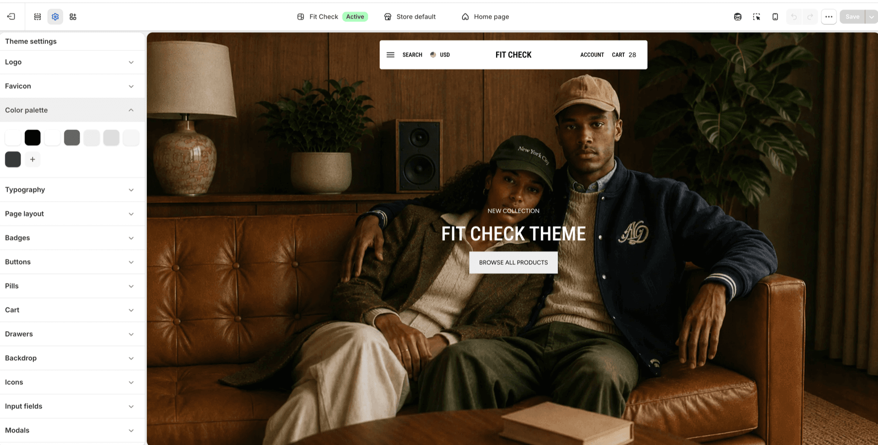
Start with a practical palette:
| Swatch role | Suggested use |
|---|---|
| Light surface | Page backgrounds, section backgrounds, product cards, drawer panels, and modal panels. |
| Dark text or accent | Body text, headings, icons, primary borders, and strong buttons. |
| Soft neutral | Alternate section backgrounds, product-card surfaces, input backgrounds, and quiet dividers. |
| Mid contrast | Secondary text, borders, disabled states, badges, and subtle controls. |
| Brand accent | Repeated calls to action, selected states, or campaign surfaces. |
Keep the palette tight. Fit Check gives you more direct color controls later, so the global palette should hold colors you expect to reuse often.
Use Palette Colors In Section Settings
Most section and block color controls open Shopify’s color picker. When the picker shows Color palette, choose one of the palette swatches when the color should stay connected to your global brand system.
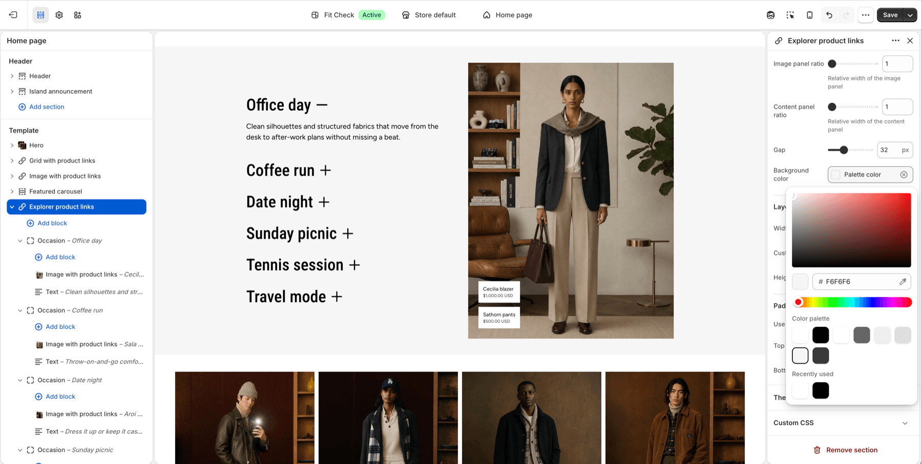
Use palette colors for:
| Surface | Why palette works well |
|---|---|
| Section backgrounds | Repeated canvas colors stay consistent across home, collection, product, page, and search templates. |
| Product-link cards | Cards and tags remain readable over editorial media when the same surface color repeats. |
| Drawers and modals | Cart, search, quick-add, and popup panels share a predictable surface system. |
| Inputs and buttons | Forms and calls to action feel consistent across newsletter, search, account, contact, and product flows. |
| Variant and swatch controls | Selected, hover, border, and dropdown states can align with the same brand neutrals. |
If a color field is blank and the setting allows blanks, Fit Check usually falls back to the surrounding page or section color. Leave blank when the section should inherit instead of owning a custom surface.
Use Direct Colors For Local Overrides
Use a direct color when one block needs a deliberate exception. Direct colors stay fixed until you change that setting again.
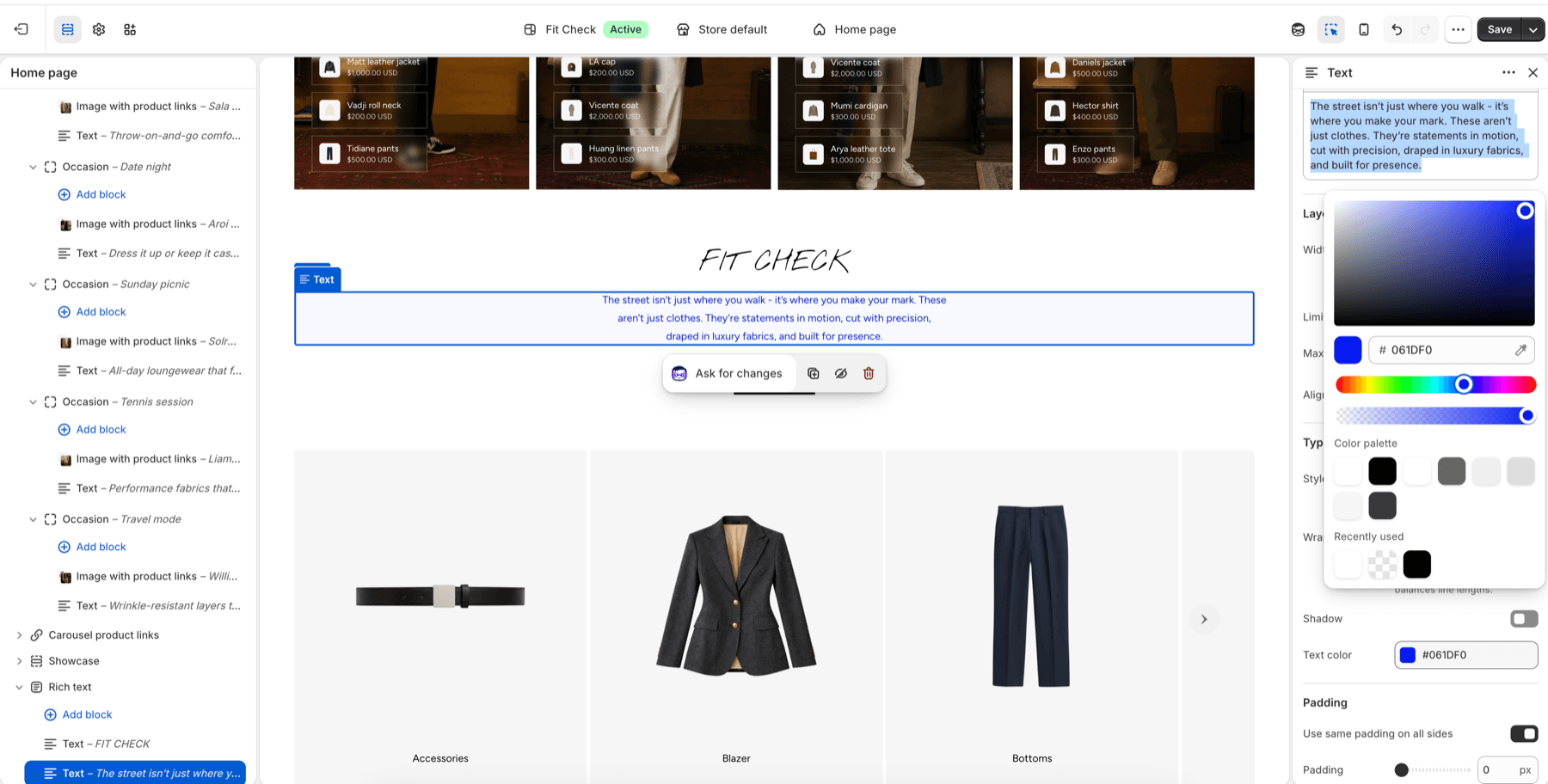
Good direct-color uses:
| Situation | Use a direct color when |
|---|---|
| Editorial accent | A single Rich text or Text block needs a special campaign or collection tone. |
| Image contrast fix | A product-link label, hotspot, or overlay needs a specific color to stay readable over one image. |
| Temporary promotion | A short-lived badge, button, or banner should not become a permanent brand swatch. |
| Third-party app block | An embedded app needs a local color adjustment to sit cleanly in the page. |
Avoid using a direct color for every repeated surface. If you copy the same hex value into many settings, add or reuse a palette swatch instead.
Palette Or Direct Color
| Choose | When to use it | Example |
|---|---|---|
| Palette color | The color should repeat across multiple pages, sections, blocks, or UI states. | Product-card surface, drawer background, secondary button, section canvas. |
| Direct color | The color is a one-off override or a temporary campaign detail. | Blue text in one Rich text block, one image overlay, one seasonal banner. |
| Blank or inherited | The surface should follow the page or parent section and does not need its own color. | A section background that should match the default page background. |
Review After Changing The Palette
After saving the palette, review these areas before publishing:
| Area | What to check |
|---|---|
| Typography | Page text, headings, primary text, and hover colors still contrast against the page background. |
| Page layout | Page background, borders, and shadows still frame sections clearly. |
| Buttons and inputs | Primary, secondary, alternative, hover, focus, and disabled states remain legible. |
| Badges and pills | Sale, sold-out, search-result, collection badges, tags, and pill labels are readable. |
| Drawers and modals | Cart drawer, search drawer, quick add, newsletter popup, and modal panels use readable backgrounds and text. |
| Variant pickers and swatches | Text options, selected states, dropdowns, borders, sold-out states, and swatches remain easy to scan. |
| Product links | Image and video product links keep enough contrast against the media behind them. |
Shopify Behavior
Shopify supports one color_palette setting for the theme. Color and background color settings can then show those palette swatches in their picker, so merchants can select a reusable palette color instead of typing a fixed value every time.
Reference: Shopify input settings: Color palette