Product Recommendations
Display Shopify-powered product recommendations in a responsive carousel.
This page uses the Shopify Search & Discovery term Product Recommendations for the workflow, while the Fit Check theme editor labels the section Recommended products.
Use this reference when you need section settings for related-product recommendations. Use the Shopify Search & Discovery guide when you need the Shopify Admin setup workflow for related products, complementary products, and filters.
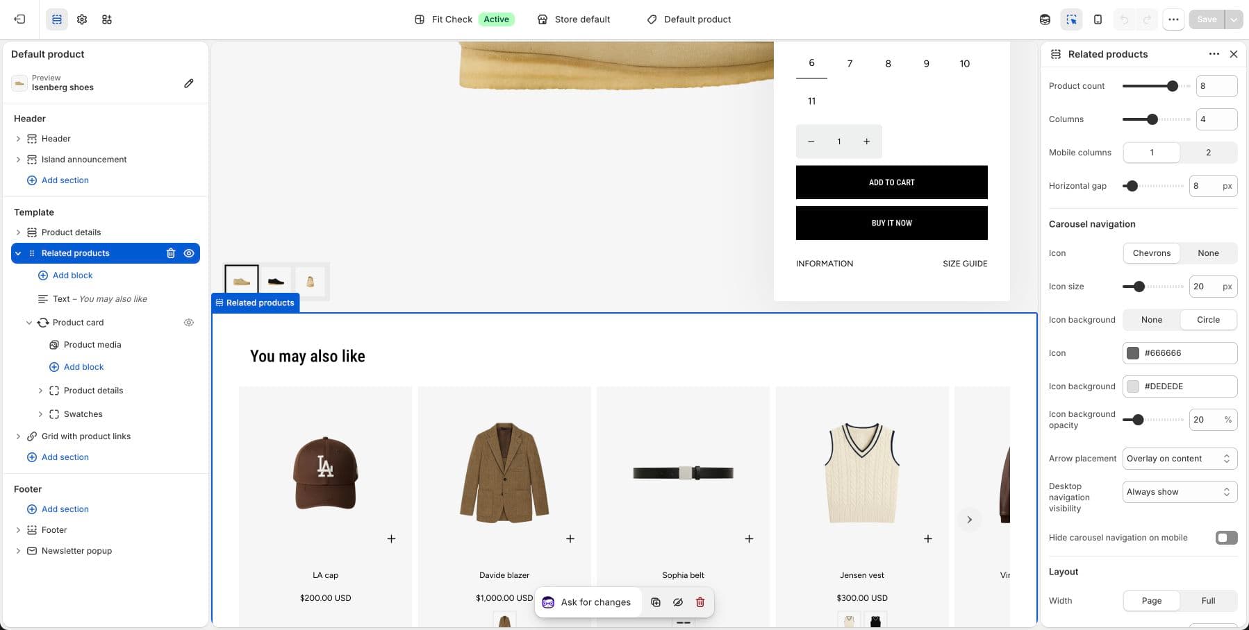
Terminology Map
| Context | Label |
|---|---|
| Shopify Search & Discovery workflow | Product Recommendations |
| Fit Check theme editor section | Recommended products |
| Recommendation type | Related products for the current product |
Configure the Section
This section is designed for the Product template. It is already included by default on product pages.
- Navigate to a product page in the theme editor.
- Click the Recommended products section to configure Product Recommendations.
- Use Shopify Search & Discovery > Recommendations when you need to manually add related products or change how manual recommendations combine with auto-generated results.
Section Settings
Product Display
| Setting | Description |
|---|---|
| Max products | Maximum number of recommended products to show. Range: 1-10. Default: 4. |
| Columns | Number of columns on desktop. Range: 1–8. Default: 4. |
| Mobile card size | Size of product cards on mobile. Large (60%) or Compact (44%). Default: Large. |
| Column gap | Spacing between product cards. Range: 0–100px. Default: 8px. |
Carousel Navigation
| Setting | Description |
|---|---|
| Arrow style | Chevron or None. Default: Chevron. |
| Icon size | Arrow icon size. Range: 12–48px. Default: 20px. |
| Icon shape | None or Circle background. Default: Circle. |
| Icon color | Arrow color. Default: #666666. |
| Background color | Arrow background color. Default: #BFBFBF. |
| Background opacity | Arrow background transparency. Range: 0–100%. Default: 20%. |
| Arrow placement | Overlay (on top of cards) or Bottom (below cards). Default: Overlay. |
| Hide nav on mobile | Hide navigation arrows on mobile. Default: Off. |
Layout
| Setting | Description |
|---|---|
| Section width | Page width or Full width. Default: Page width. |
| Content gap | Spacing between heading and product grid. Range: 0–100px. Default: 12px. |
| Background color | Set the section background or leave blank to inherit the global page background. |
| Padding | Top and bottom padding with unified or separate controls. Range: 0–100px. Default: 32px. |
Blocks
Add text blocks for section headings, product item blocks for product-card presentation, container blocks for layout composition, and app blocks for third-party integrations.
Product item blocks can include media, title, price, swatches, and quick-add controls depending on the product-card block settings.
Empty Recommendations
Shopify recommendations can be empty for new stores, new products, products without enough activity, or products that Shopify cannot match yet. If no recommendations are available, the section stays out of the way until Shopify returns products.
For setup steps in Shopify admin, see the Shopify Search & Discovery guide.
Publish Checklist
- Preview a product with enough history or product data to return recommendations.
- Preview a product where recommendations are empty.
- Test product cards with sale pricing and multiple variants.
- Check quick add and swatches if enabled in product item blocks.
- Review carousel controls on desktop and mobile.