Typography
Use this guide to set Fit Check typography from the global Theme settings > Typography panel, then apply those presets to headings, text blocks, product-card text, buttons, badges, forms, drawers, and other local surfaces.
Typography works best when you treat the global settings as the system and local block settings as exceptions. Set page colors, font slots, default body text, and H1-H6 presets first. Then choose Default, a heading preset, or Custom inside individual text and heading blocks only when the local surface needs it.
Setup Order
- Open TypographyIn the theme editor, click Theme settings, open Typography, and set text colors before tuning font sizes.
- Choose font slotsAssign the Heading, Subheading, Body, Display, and Alternative font slots. These slots become the source fonts for presets and local typography controls.
- Set default body textTune the Default size, line height, and letter spacing for paragraphs, descriptions, forms, and general interface text.
- Set H1-H6 presetsUse H1 through H4 for primary page and section hierarchy, then reserve H5 and H6 for compact labels, meta text, and special cases.
- Apply presets locallySelect a Heading or Text block and choose Default, H1-H6, or Custom from the Style menu depending on the role of that specific text.
- Preview real pagesReview home, collection, product, search, cart, and mobile layouts after typography changes so hierarchy, wrapping, and contrast remain stable.
Ownership Model
| Layer | Owns |
|---|---|
| Theme settings > Typography | Page text, page heading, link, and hover-link colors; the five global font slots; Default body text; H1-H6 preset values. |
| Font slots | Which Shopify font family is available for Heading, Subheading, Body, Display, and Alternative uses. |
| Default text | Base body size, line height, and letter spacing used by paragraph and general text surfaces. |
| Heading presets H1-H6 | Reusable size, line-height, letter-spacing, case, and source font decisions for display hierarchy. |
| Local text and heading blocks | Whether that block inherits Default, uses H1-H6, or switches to Custom typography for a one-off treatment. |
| Other global setting groups | Buttons, inputs, badges, prices, swatches, drawers, and modals can have their own typography controls while still using the global font slots. |
Use global Typography for decisions that should repeat across the store. Use local block Style controls only when one section needs a different text role or visual treatment.
Open Typography
In the theme editor, click the Theme settings gear, then open Typography.
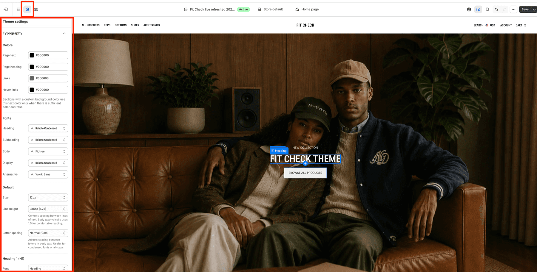
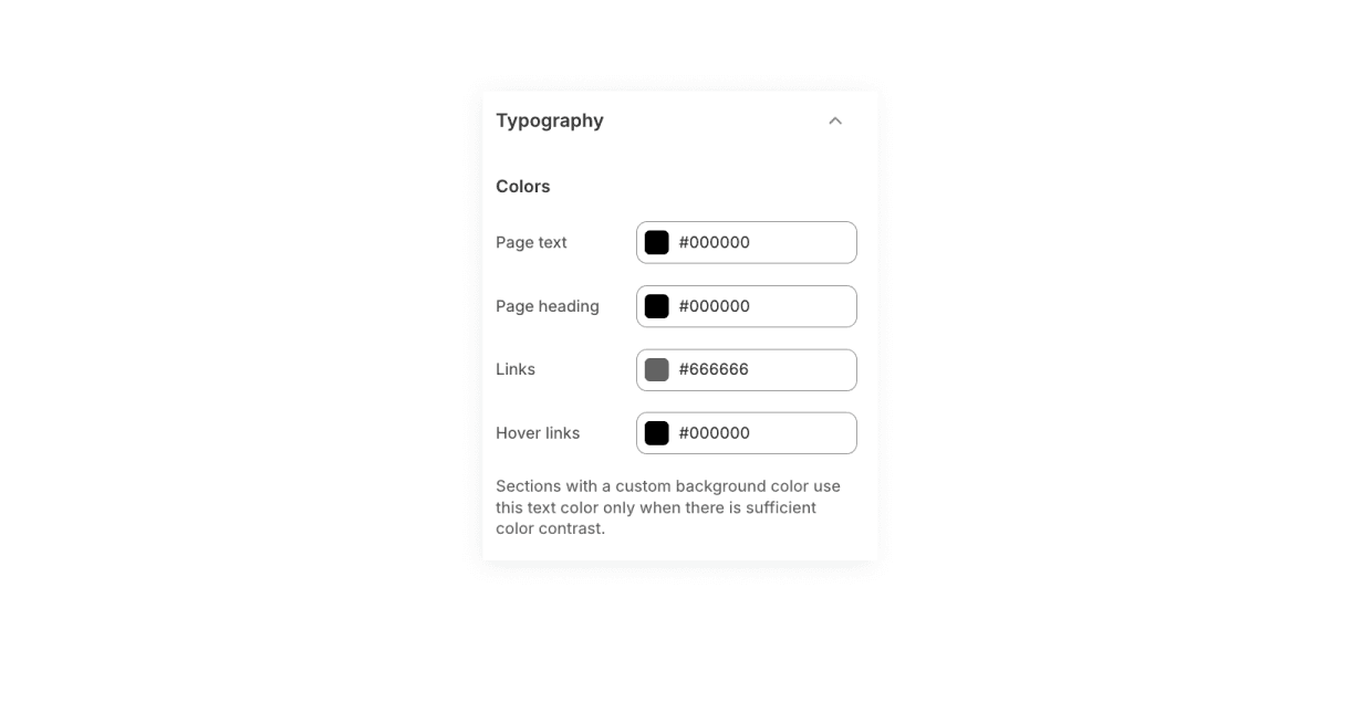
| Area | Use it for |
|---|---|
| Page text | Main body and interface text color across the store. |
| Page heading | Default heading color across templates and sections. |
| Links | Link color before hover. |
| Hover links | Link color on hover and active pointer states. |
Set color contrast before choosing sizes. If a section has its own background color, review that section after typography changes so page text and headings stay readable.
Choose Font Slots
The Fonts group assigns the reusable source fonts used by Typography presets and local controls.
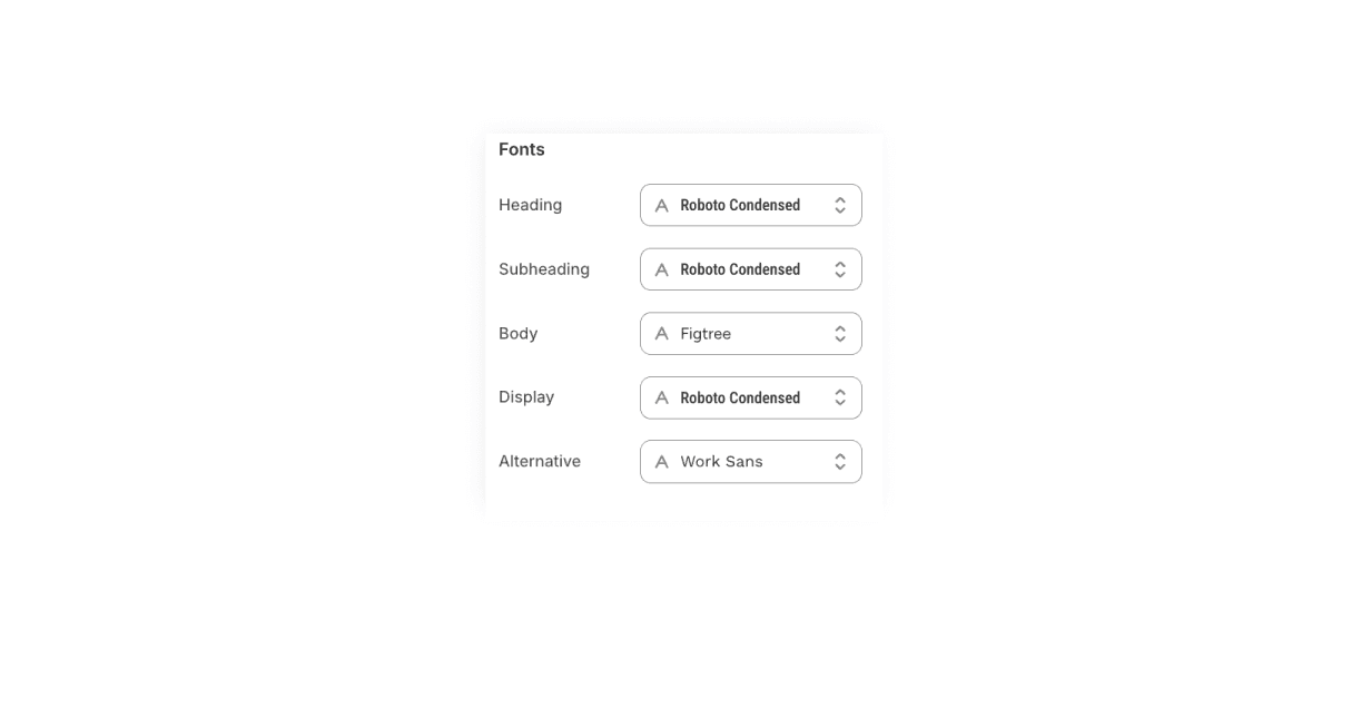
| Font slot | Use it for |
|---|---|
| Heading font | Primary heading and page-title font source. |
| Subheading font | Secondary heading, eyebrow, and smaller heading font source. |
| Body font | Paragraphs, descriptions, forms, labels, and most interface text. |
| Display font | Large hero, editorial, or campaign text. |
| Alternative font | Intentional accent typography for special surfaces. |
Set Default Text
The Default group controls the base body treatment.
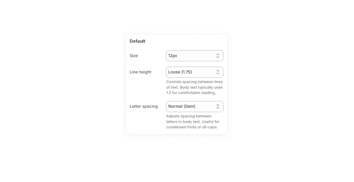
| Default setting | Use it for |
|---|---|
| Size | Base body text size. The screenshot uses 12px. Increase only when body copy feels too small across the store. |
| Line height | Vertical rhythm for paragraphs and general text. Loose values are useful for body copy; tighter values are better reserved for large display presets. |
| Letter spacing | Horizontal spacing for body and interface text. Keep Normal for most body copy. |
Default body text should be comfortable in paragraphs, product descriptions, forms, cart text, and compact UI. Avoid forcing uppercase at the global Default level unless the whole brand system expects it.
Set Heading Presets
H1-H6 presets give local blocks a shared visual scale.
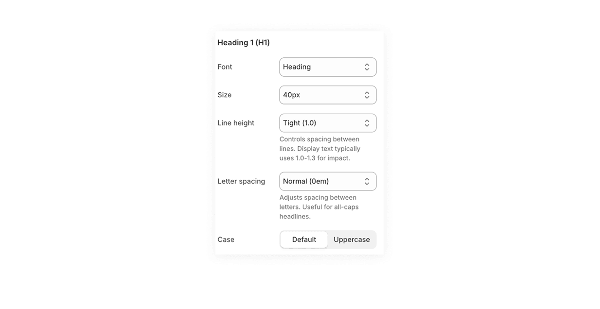
| Preset | Typical role | Screenshot value |
|---|---|---|
| Heading 1 (H1) | Page hero, main page title, strongest editorial headline. | Heading font, 40px, Tight 1.0, Normal letter spacing, Default case. |
| Heading 2 (H2) | Major section title or secondary hero heading. | Heading font, 32px, Normal 1.3, Normal letter spacing, Default case. |
| Heading 3 (H3) | Smaller section title, product module heading, card group title. | Heading font, 24px, Normal 1.3, Normal letter spacing. |
| Heading 4 (H4) | Compact section heading, product detail heading, accordion or panel title. | Follow the same preset structure as H1-H3. |
Large headings usually need tighter line-height than body text. Use uppercase only when the word length, letter spacing, and mobile wrapping still look deliberate.
Use Alternative Headings
H5 and H6 are alternative heading presets for special use cases.
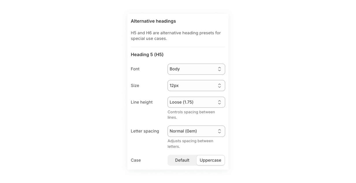
| Preset | Typical role | Screenshot value |
|---|---|---|
| Heading 5 (H5) | Eyebrows, small card headings, compact promotional labels. | Body font, 12px, Loose 1.75, Normal letter spacing, Uppercase. |
| Heading 6 (H6) | Smallest heading-like label, metadata, dense utility text. | Body font, 10px, Loose 1.75, Normal letter spacing, Uppercase. |
Use H5 and H6 sparingly. They are most useful when the text is short and scannable. For longer copy, Default body text usually reads better.
Apply Presets To Blocks
After the global presets are set, select a Heading or Text block and use its Style menu.
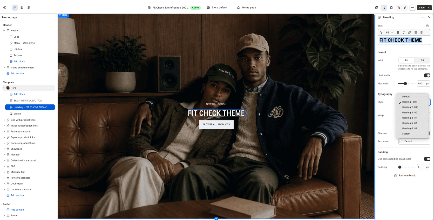
| Style choice | Use it when |
|---|---|
| Default | The block should follow body/default text styling or the surface already supplies the right typography. |
| Heading 1 (H1) | One primary page or hero headline needs the strongest preset. |
| Heading 2 (H2) | A major section title needs strong hierarchy without competing with the page headline. |
| Heading 3 (H3) | A medium heading, card group title, or module title needs structure. |
| Heading 4 (H4) | A compact heading or panel title needs heading treatment. |
| Heading 5 (H5) | A small uppercase label, eyebrow, or compact promotional line needs emphasis. |
| Heading 6 (H6) | Dense metadata or the smallest heading-like label needs a preset. |
| Custom | One block needs a one-off font, size, line height, or letter spacing that should not become a global preset. |
Use heading presets for hierarchy, not just visual size. A page should usually have one strongest H1-style visual treatment, then H2 and H3 treatments for major groups below it.
Default, Preset, Or Custom
| Choose | When to use it | Example |
|---|---|---|
| Default | The text should follow the theme body/default text system. | Paragraph text, descriptions, form helper text, cart copy. |
| Heading preset | The text should follow a repeatable hierarchy across pages. | Hero headline, section title, product-card title, FAQ heading. |
| Custom | The text is a deliberate one-off campaign or composition treatment. | One editorial hero, a seasonal feature, or a special landing-page headline. |
If you repeat the same Custom values in several places, promote that treatment into a global H1-H6 preset instead. That keeps future editing predictable.
Publish Checklist
| Area | What to confirm |
|---|---|
| Home hero and rich text | Large headings wrap cleanly and do not cover buttons or product-link content. |
| Collection and search cards | Product titles, prices, badges, quick add, and swatches remain scannable. |
| Product page | Product title, price, variant labels, accordions, size guide, stock status, and buy buttons keep a clear hierarchy. |
| Cart and drawers | Cart title, line items, summary text, search drawer text, and modal text remain readable at small sizes. |
| Mobile | H1-H3 text wraps without clipping, H5-H6 labels stay legible, and buttons do not overflow. |
| Contrast | Page text, page heading, links, and hover links remain readable on default and custom section backgrounds. |
Shopify Behavior
Shopify’s theme editor lets merchants customize store content and appearance and preview changes in real time. Fit Check exposes Typography through Theme settings, which are organized by settings_schema.json, and local blocks use input settings such as font pickers, ranges, selects, and segmented controls to choose values.
References: