Features Carousel
Features carousel presents feature cards in a swipeable row. Use it for product benefits, campaign highlights, service promises, store values, or any repeated feature story that should browse horizontally.
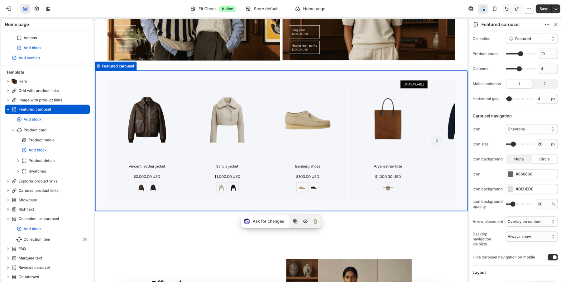
Configure the Section
- In the theme editor, click Add section.
- Select Features carousel.
- Add feature item blocks and choose image, heading, text, and card styling.
- Set columns, mobile columns, gap, and carousel navigation.
Section Settings
| Setting | Description |
|---|---|
| Maximum items | Maximum number of feature cards to display. Range: 1-24. |
| Columns (desktop) | Number of visible carousel cards on desktop. Range: 1-6. |
| Columns (mobile) | 1 or 2 cards on mobile. |
| Gap | Space between cards. Range: 0-100px. |
| Carousel navigation | Icon style, custom icon, icon size, background shape, color, opacity, placement, desktop visibility, and mobile visibility. |
| Width | Page or Full. Default: Page. |
| Background color | Optional section background override. |
| Padding | Use one all-sides value or set top, bottom, left, and right independently. |
Feature Item Blocks
Each feature item can include:
| Block setting | Description |
|---|---|
| Image | Feature image, icon, or product-style visual. |
| Feature heading | The card title. |
| Text | Supporting feature or benefit copy. |
| Heading style | Default typography, heading presets, or custom typography controls. |
| Image ratio | Square, portrait, landscape, wide, or auto. |
| Text alignment | Left, center, or right. |
Tips
- Keep each feature card short enough to scan while swiping.
- Use consistent image ratios across cards for a cleaner carousel rhythm.
- Set desktop navigation to always show when the section is important to the page story.