Product Links
Product Links covers every Fit Check section and media block that adds shoppable product cards to images or videos. Use this page for Grid with product links, Carousel product links, Video with product links, Explorer product links, and reusable Image with product links or Video with product links blocks.
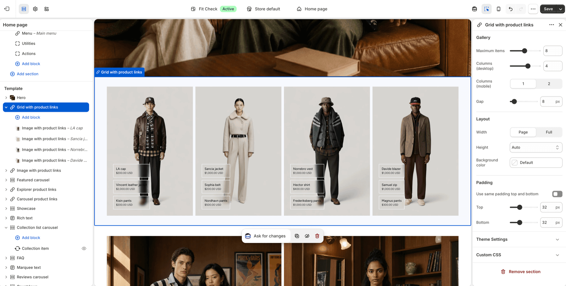
Configure Product Links
- Choose the surfaceAdd Grid with product links, Carousel product links, Video with product links, Explorer product links, Detail Explorer, FAQ, or another section that accepts product-link media blocks.
- Add image or video mediaChoose Image with product links for still media or Video with product links for Shopify-hosted video.
- Select productsAssign linked products or custom links in each image or video product-link block.
- Choose the click actionKeep product-page navigation or let product-backed links open quick add. Custom links always navigate to their assigned destination.
- Tune card styleConfigure card position, background opacity, blur, product image, title, price, and hover or active states.
- Check visibilityPreview each aspect ratio and viewport. Product links should remain visible and readable without being cropped by the media.
Covered Sections
| Surface | Recommended use |
|---|---|
| Grid with product links | Lookbook grids, styled outfits, editorial product photography, and home-page shopping stories. |
| Carousel product links | Focused shoppable slides, campaign rows, and smaller product-link stories that should swipe. |
| Video with product links | Short-form videos, motion lookbooks, and video/image mixes with product cards. |
| Explorer product links | Occasion rows or fit guides where each row changes the shoppable media panel. |
| Image with product links | Still-image media blocks used inside product-link sections, FAQ, Detail Explorer, Showcase-style layouts, and compatible containers. |
| Video with product links | Shopify-hosted video media blocks with the same linked-product card controls as image blocks. |
| Detail Explorer and FAQ media | Supporting media beside accordion content when a visual example helps customers choose products. |
Section Settings
| Section | Key controls |
|---|---|
| Grid with product links | Maximum items, desktop columns, mobile columns, gap, width, height, alignment, background color, and padding. |
| Carousel product links | Maximum items, slide gap, width, height, alignment, carousel navigation, arrow placement, mobile navigation, and padding. |
| Video with product links | Maximum items, desktop columns, mobile columns, gap, width, height, position, baseline alignment, and padding. |
| Explorer product links | Accordion icon, auto-close behavior, dividers, heading style, image position, border radius, panel gap, width, and padding. |
Product Link Settings
| Setting family | What to check |
|---|---|
| Media | Image or Shopify-hosted video, focal point, aspect ratio, object fit, autoplay, mute, loop, or controls for video. |
| Linked products | Product selection, card count, order, title, price, and optional image display. |
| Product link action | Product-page navigation or quick add for product-backed links; custom links remain normal navigation. |
| Card position | Placement that avoids faces, product details, embedded text, and video controls. |
| Card background | Opacity and blur values that keep text readable over light or dark media. |
| Responsive behavior | Desktop hover, mobile tap, touch target size, and no cropped cards. |
Product Data and Metafields
Use product picker settings for the visible shoppable cards. Use Shopify metafields for reusable supporting details such as sizing notes, fit scores, care instructions, or campaign copy when a section or block offers dynamic source content.
| Data source | Use for |
|---|---|
| Product picker | The Product link card customers can open on the product page or in quick add. |
| Product image | Product-card thumbnail, fallback media, and product recognition. |
| Product price | The visible linked-card price when price display is enabled. |
| Variant data | Availability, option choices, and purchase state after customers open the product page or quick-add modal. |
| Metafields | Reusable non-card details that should follow the product across templates. |
Publish Checklist
- Keep product cards away from faces, product details, text embedded in photography, and video controls.
- Test each linked product card on desktop hover and mobile tap.
- Test at least one sale product and one product with multiple variants so linked-card price, product-page navigation, and quick-add states are clear.
- Review image and video crops after changing aspect ratio, height, columns, or mobile columns.
- Confirm video controls and product cards do not occupy the same corner.