Product Details Containers
Use Product details containers when the product page needs more than one purchase-panel layout. The Product details section owns the media gallery and overlay system; Container blocks create the panels inside that system; product blocks create the actual buying and information flow.
Setup Order
- Start with Product detailsSet the section height, media behavior, overlay layout direction, overlay position, gap, blur, and uniform overlay sizing before tuning individual panels.
- Choose the container patternUse one purchase container for a compact buying card, or split content into separate containers when information and purchase controls should live apart.
- Group product blocks intentionallyKeep title, price, variants, buy buttons, size guide, disclosures, and app blocks in the container that matches the customer task.
- Tune container surfacesUse each Container block for width, padding, inside spacing, alignment, background, border, radius, and shadow.
- Preview mobileCheck long product titles, app blocks, variant controls, buy buttons, and disclosure rows on mobile before publishing.
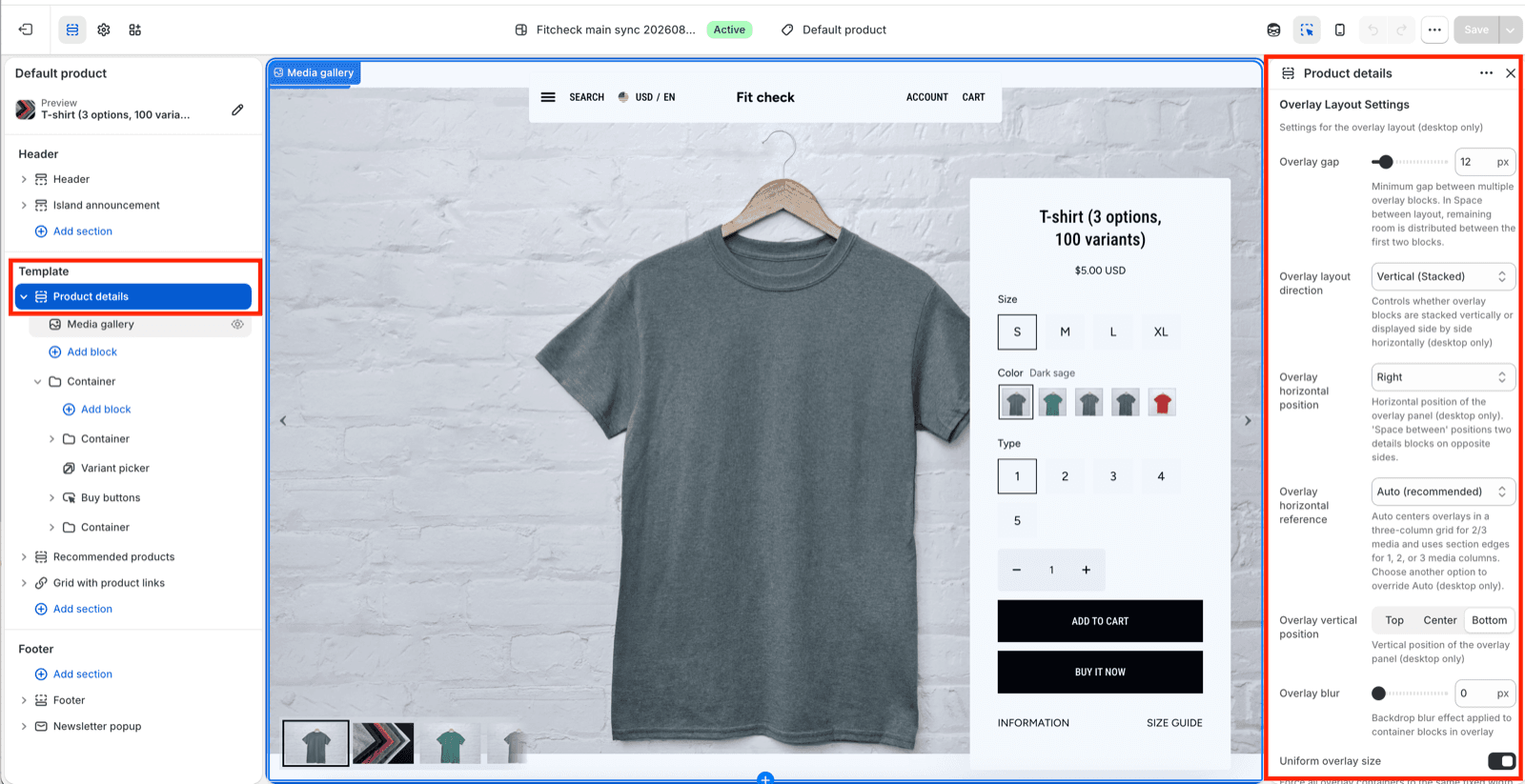
Layer Ownership
| Layer | Owns |
|---|---|
| Product details section | Media gallery, section height, header accounting, overlay layout, overlay position, overlay gap, overlay blur, and uniform overlay size. |
| Container blocks | Product information panels, inside direction, alignment, gap, width, padding, surface color, border, radius, and shadow. |
| Product blocks | Title, price, variant picker, quantity, buy buttons, size guide, disclosures, stock status, product information, and app blocks. |
Use section settings to place the panels. Use Container settings to shape each panel. Use product blocks to decide what customers can read, select, and buy.
Pattern 1: Split Overlay Containers
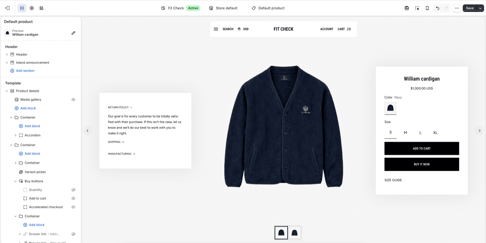
Use split containers when the product page needs a larger information panel and a separate focused buying panel. This works well for policy accordions, manufacturing notes, fit/care content, and a purchase panel that should stay visually distinct.
| Container | Typical contents |
|---|---|
| Information container | Accordion, tabs, product description, disclosure rows, fit notes, care notes, or custom content. |
| Purchase container | Product title, price, variant picker, quantity, buy buttons, size guide, stock status, and app blocks. |
Pattern 2: Centered Purchase Container
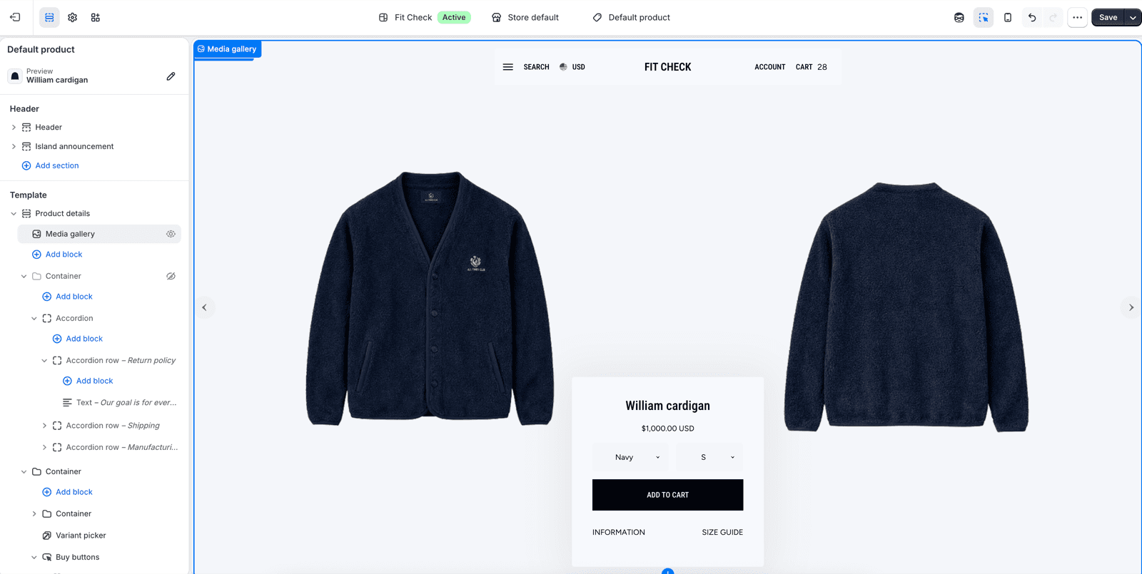
Use a centered purchase container when the product media should frame the buying action and the product does not need a large side panel. Keep the container compact: title, price, variant picker, add-to-cart, and the most important supporting links.
Pattern 3: Side Purchase Container
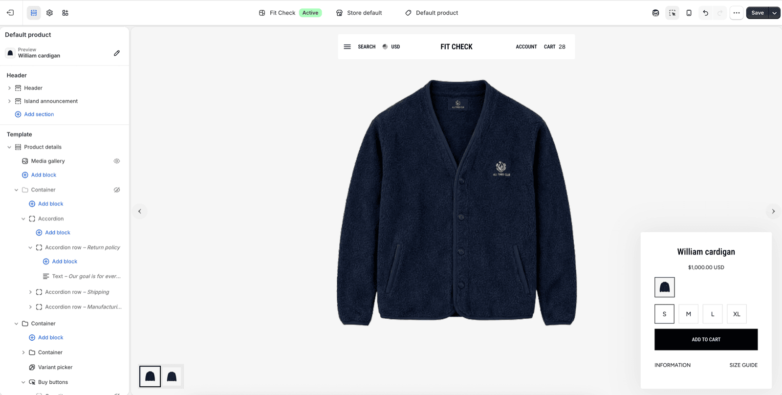
Use a side purchase container when the buying panel should be easy to scan without covering the main product media. It is also ideal when the page should showcase large product images first while still keeping the purchase form easy to find. This is usually the safest compact pattern for products with multiple sizes, swatches, or app blocks.
Container Guidance
| Decision | Recommendation |
|---|---|
| One container or two | Use one container for a simple purchase card. Use two containers when disclosures, shipping, manufacturing, or fit content needs its own panel. |
| Overlay gap | Set the minimum space between panels in the Product details section, then use each container’s gap setting for spacing inside the panel. |
| Uniform overlay size | Enable it when multiple panels should feel intentionally matched. Leave it off when the information panel and purchase panel have different content density. |
| Container width | Use custom width for deliberate purchase-card sizing, but check mobile before publishing. |
| Container links | Avoid whole-container links in Product details because variant pickers, buy buttons, disclosure rows, and app blocks are already interactive. |
| Surface styling | Use background, border, radius, and shadow when a panel needs contrast over the media gallery. |
Product Block Grouping
| Goal | Recommended block grouping |
|---|---|
| Fast purchase | Title, price, variant picker, quantity, buy buttons. |
| Sizing confidence | Variant picker, sizing fit, size guide, product disclosures. |
| Editorial confidence | Product description, accordion rows, tabs, product information, app blocks. |
| Compact mobile flow | Keep the first visible container focused on price, variants, and add-to-cart; place longer supporting content after the buying controls. |
Publish Checklist
| State | What to confirm |
|---|---|
| Desktop overlay | Containers do not cover important product media or header controls. |
| Multiple panels | Product details overlay gap keeps panels separated without pushing them off screen. |
| Mobile | Containers stack in a readable order and controls remain tap-friendly. |
| Variant picker | Swatches, dropdowns, and sold-out states fit inside the chosen container width. |
| Buy buttons | Add-to-cart and accelerated checkout remain visible and do not crowd size guide or app blocks. |
| Disclosures | Accordion rows open without overlapping the purchase container or media controls. |