Swatches
The Swatches Theme settings group controls global visual swatch behavior and appearance.
Use Variant Pickers and Swatches for the full setup workflow across product option data, global settings, product-card swatches, and the Product page Variant picker block.
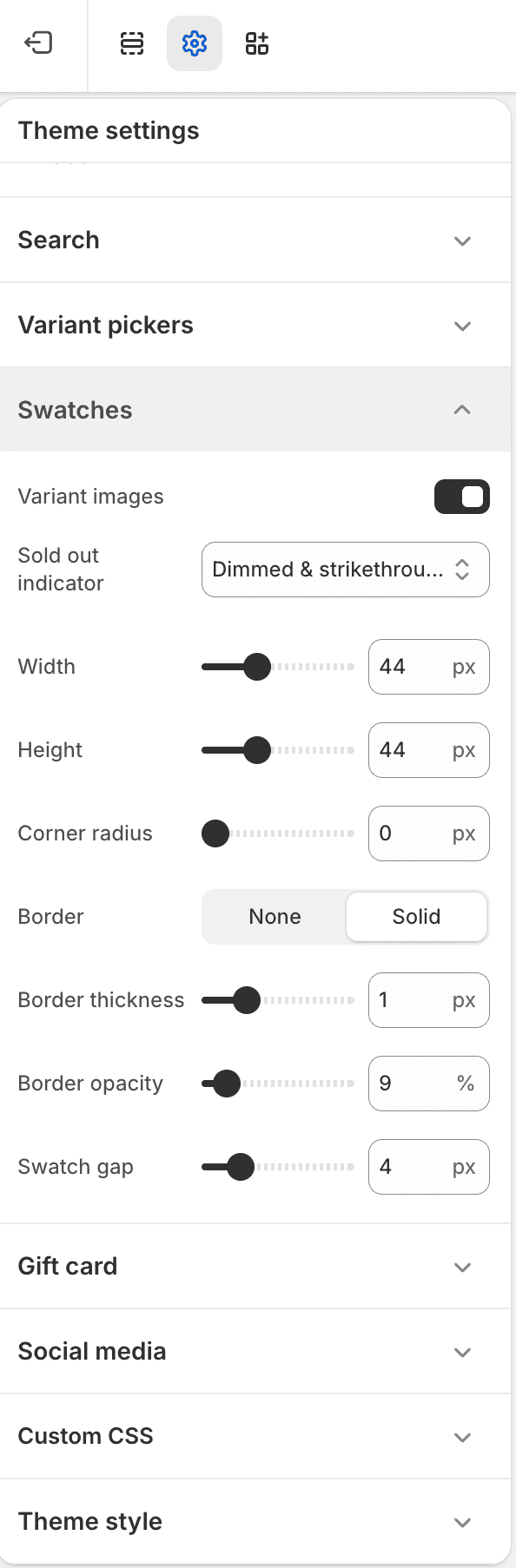
| Setting | Use it for |
|---|---|
| Variant images | Show variant images as swatches when product variant images are available. |
| Sold out indicator | Choose how unavailable swatches are marked. |
| Width and height | Set visual swatch dimensions. |
| Border radius | Set swatch shape. |
| Border | Choose border style. |
| Border width and opacity | Tune swatch border appearance when borders are enabled. |
| Swatch gap | Set spacing between swatches. |
Ownership Notes
- Variant picker text option, selected state, underline, and dropdown colors are in Variant pickers.
- Product option names and block-level picker modes are configured in the Variant picker block.