Divider
A simple horizontal line to visually separate content sections on a page. Customize the thickness, width, alignment, and corner style.
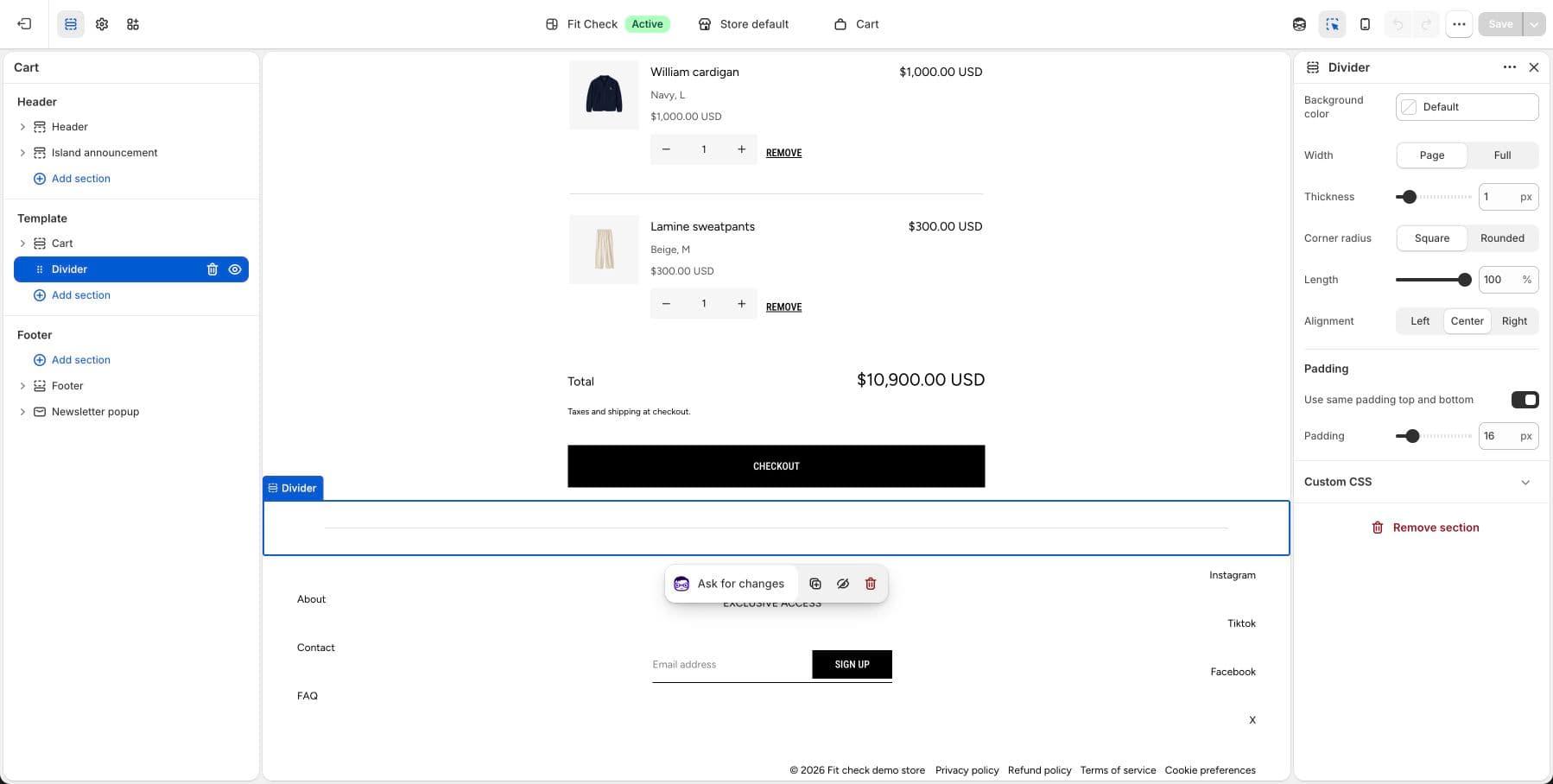
Configure the Section
- In the theme editor, click Add section.
- Select Divider.
Section Settings
| Setting | Description |
|---|---|
| Background color | Set the section background or leave blank to inherit the global page background. The divider line inherits the foreground color. |
| Section width | Page width or Full width. Default: Page width. |
| Thickness | Line thickness. Range: 0.5–5px. |
| Corner radius | Square or Rounded line ends. |
| Width | How much of the available width the line fills. Range: 5–100%. |
| Alignment | Left, Center, or Right. |
| Padding | Use one all-sides value or set top, bottom, left, and right independently. Range: 0–100px. |