Typography
Fit Check uses five font slots so headings, body text, display text, and accent text can be tuned independently.
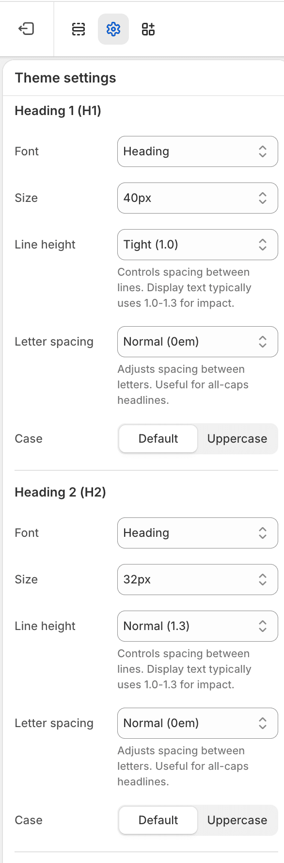
Use the Typography guide for the screenshot-led setup order across text colors, font slots, Default body text, H1-H6 presets, alternative headings, and local block Style menus.
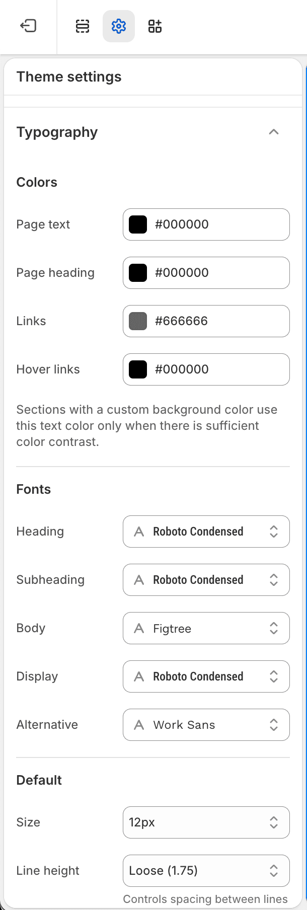
Font Slots
| Slot | Common use |
|---|---|
| Heading | Page titles and section headings. |
| Subheading | Smaller headings and supporting labels. |
| Body | Paragraphs, descriptions, forms, and most interface text. |
| Display | Large hero or campaign text. |
| Alternative | Accent treatments used intentionally on specific surfaces. |
Heading Levels
Each heading level from H1 through H6 can use its own font slot, size, line height, letter spacing, and text case. Review headings on mobile after changing larger sizes so page titles, section titles, and product titles remain readable.
For a step-by-step workflow with current theme-editor screenshots, see the Typography guide.
Where Typography Applies
| Area | What to review |
|---|---|
| Body text | Paragraph size, line height, and letter spacing. |
| Badges and pills | Compact labels on product cards and filters. |
| Buttons and input fields | Action labels, form labels, and field text. |
| Product cards | Card titles, prices, badges, and quick-add labels. |
| Drawers and modals | Search, cart, quick-add, and popup text. |