Search Page
The search template provides two storefront experiences: Search for conversational predictive search and Search grid for a traditional filtered results layout.
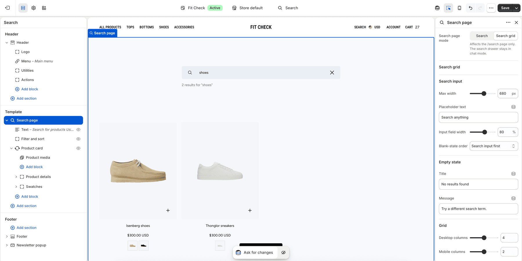
Setup Order
- Choose search action modeOpen Theme settings > Search and choose whether the header search icon opens a drawer or the search page.
- Choose page modeSet the /search page to Search for conversational discovery or Search grid for filtering and sorting.
- Select resourcesEnable products, collections, articles, and pages based on what customers should be able to find.
- Prepare filtersWhen using Search grid mode, configure Shopify Search & Discovery storefront filters and review filter blocks.
- Test queriesSearch for products, collections, content pages, no-result terms, and mobile queries.
Features
Search Page Mode
Choose the page mode in the Search page section settings on the Search template.
| Mode | Best for |
|---|---|
| Search | Conversational discovery, suggested searches, and predictive results across products, collections, articles, and pages. |
| Search grid | Traditional product search with filters, sorting, pagination, configurable columns, and product-card blocks. |
The search drawer always uses the Search mode interface, even when the /search page is set to Search grid mode.
Search Mode
- The search input is prominently displayed.
- Results appear as cards in a scrollable feed.
- Results include products, collections, blog articles, and pages when those resources are enabled.
- Popular searches can appear as quick-start suggestion pills.
Predictive Search
As customers type, predictive results appear in real time using Shopify’s Predictive Search API. Results are grouped by type: products, collections, articles, and pages.
Search Grid
Search grid mode displays products in a responsive grid and can include:
- Filter blocks
- Sorting controls
- Product-card blocks with swatches and quick add when enabled
- Empty-state text with configurable ordering relative to the search input
- Desktop and mobile column controls
- Independent row and column gaps
- Edge-to-edge mobile cards
Search Drawer
The search is also accessible as a drawer overlay from the header, providing the same search experience without leaving the current page.
Section Settings
| Setting | Description |
|---|---|
| Search page mode | Section setting on the Search page section. Choose Search or Search grid for the /search page. |
| Max width | Maximum width of the chat or product-grid search input container. |
| Placeholder text | Search input placeholder text. |
| Input field width | Width of the search input within the configured max-width container. |
| Blank-state order | Controls whether blank search states show the input or the empty-state message first. |
| Empty-state title and message | Text shown when no results are found. |
| Desktop columns | Search grid result columns on desktop. |
| Mobile columns | Search grid result columns on mobile. |
| Background color | Set the search section background or leave blank to inherit the global page background. |
| Padding | Top, bottom, and mode-specific spacing controls. |
| Products per page | Search grid mode only. Range: 12-48. Default: 24. |
Publish Checklist
- Search a product title and a partial product title.
- Search a collection title.
- Search an article or page title when those resources are enabled.
- Search a no-result term and review the empty state.
- Apply and clear a filter in Search grid mode.
- Sort Search grid results.
- Open search from the header drawer and from
/search. - Check mobile keyboard focus and result spacing.