Featured blog post
Display blog posts in a responsive grid layout. Use this section on your home page or landing pages to highlight recent articles, lookbooks, or editorial content.
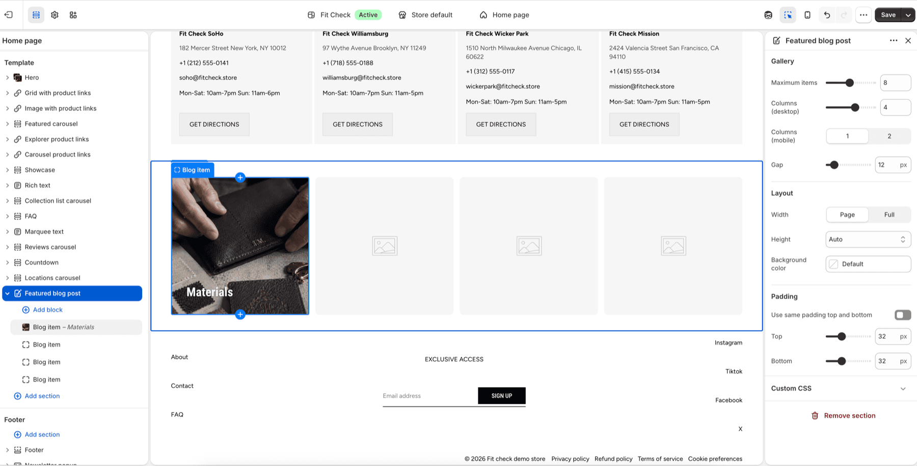
Configure the Section
- In the theme editor, click Add section.
- Select Featured blog post from the General category.
- Add Blog item blocks to choose which posts to feature.
Section Settings
Gallery
| Setting | Description |
|---|---|
| Maximum items | Max number of blog posts to display. Range: 1–16. Default: 8. |
| Desktop columns | Number of columns on desktop. Range: 1–6. Default: 4. |
| Mobile columns | 1 column or 2 columns. Default: 1. |
| Gap | Spacing between posts. Range: 0–100px. Default: 12px. |
Layout
| Setting | Description |
|---|---|
| Width | Page width or Full width. Default: Page width. |
| Height | Auto, Full screen, or Custom (small/medium/large/custom input). Default: Auto. |
| Position | Vertical alignment when a height is set — Top, Center, or Bottom. Default: Center. |
| Align baseline | Align items to the last baseline (when position is Bottom). Default: Off. |
| Background color | Set the section background or leave blank to inherit the global page background. |
| Padding | Use one all-sides value or set top, bottom, left, and right independently. Range: 0–100px. Default: 0px. |
Blog Item Blocks
Each Blog item block lets you select a specific blog post to feature. The block renders the post’s featured image, title, excerpt, and publication date.