Immersive Showcase
A 3D stacked card section that fans cards in perspective, creating a layered depth effect. Visitors can click or swipe through the stack. Use it for testimonials, feature highlights, team members, or any content that benefits from a dramatic, interactive presentation.
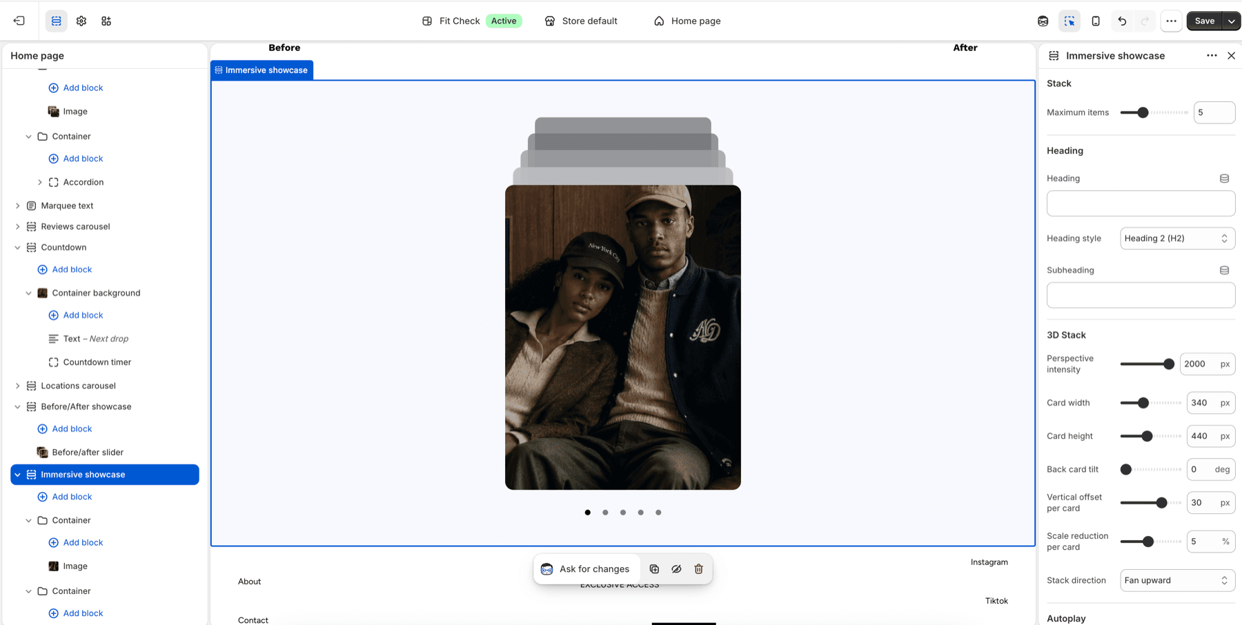
Configure the Section
- In the theme editor, click Add section.
- Select Immersive showcase from the Interactive category.
- Add card blocks — supports the same card types as other card sections.
Section Settings
| Setting | Description |
|---|---|
| Maximum items | Number of cards visible in the stack. Range: 2–12. Default: 5. |
| Heading | Optional heading above the stack. |
| Heading tag | HTML tag for the heading — H2, H3, or H4. Default: H2. |
| Subheading | Optional subheading text. |
| Perspective intensity | 3D perspective depth. Range: 400–2000px. Default: 800. Lower values create stronger 3D effects. |
| Card width | Width of each card. Range: 200–600px. Default: 340px. |
| Card height | Height of each card. Range: 250–700px. Default: 440px. |
| Back card tilt | Rotation angle for stacked cards behind the front. Range: 0–15 degrees. Default: 5. |
| Vertical offset | How much each card is offset vertically from the one in front. Range: 5–40px. Default: 16px. |
| Scale reduction | How much each card shrinks relative to the one in front. Range: 1–10%. Default: 5%. |
| Stack direction | Fan upward or Fan downward. Default: Fan upward. |
| Auto-rotate | Automatically cycle through cards. Default: Off. |
| Rotation speed | Seconds between auto-rotations. Range: 2–10s. Default: 4s. |
| Width | Page width or Full width. Default: Page width. |
| Background color | Optional section background color. Leave Default to use the theme surface. |
| Padding | Top and bottom padding. Range: 0–100px. Default: 32px top/bottom. |
Card Types
Review Card
Display a customer review with star rating, review text, author name, and optional author photo.
Feature Card
Highlight a product feature with an image, title, and description.
Team Member Card
Introduce a team member with photo, name, role, and bio.
Milestone Card
Show a company statistic with a number value and label.
Location Card
Display a store location with image, name, address, and link.
Container Card
A flexible card that accepts any child blocks for custom layouts.