Variant Pickers
The Variant pickers Theme settings group controls the global visual treatment for variant text options, selected states, buttons mode, underline mode, and dropdown appearance.
Use Variant Pickers and Swatches for the full setup workflow across product option data, global settings, product-card swatches, and the Product page Variant picker block.
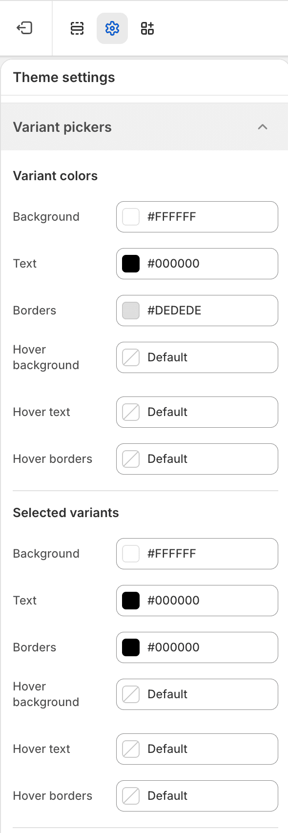
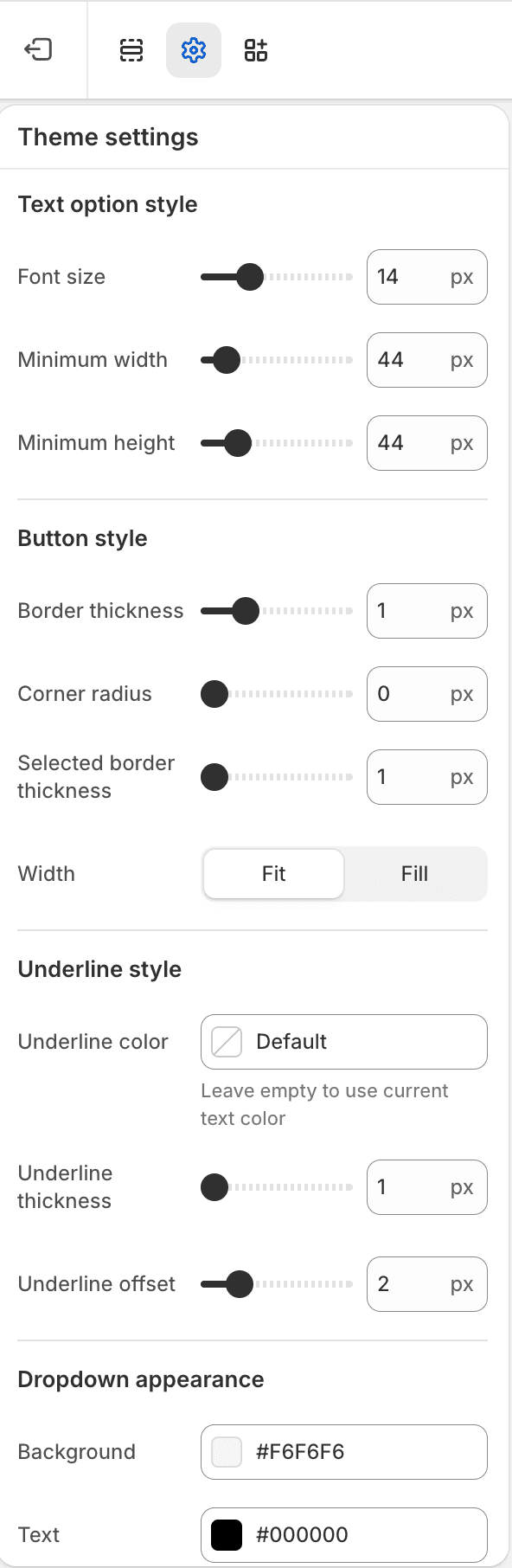
| Area | Settings |
|---|---|
| Variant colors | Base background, text, border, and hover colors. |
| Selected variants | Selected background, text, border, and hover colors. |
| Text option style | Font size, minimum width, and minimum height. |
| Button style | Border width, border radius, selected outline width, and button width behavior. |
| Underline style | Underline color, thickness, and offset. |
| Dropdown appearance | Dropdown background, text, and border colors. |
Ownership Notes
- The Variant pickers group controls text option and dropdown styling.
- Visual swatch size, radius, border, opacity, gap, variant image behavior, and sold-out indicator are in Swatches.
- Product-card title/media/price composition is handled by Product item blocks, not by this Theme settings group.