Input Fields
The Input fields Theme settings group controls form fields, search inputs, filter inputs, cart discount fields, and checkbox styling.
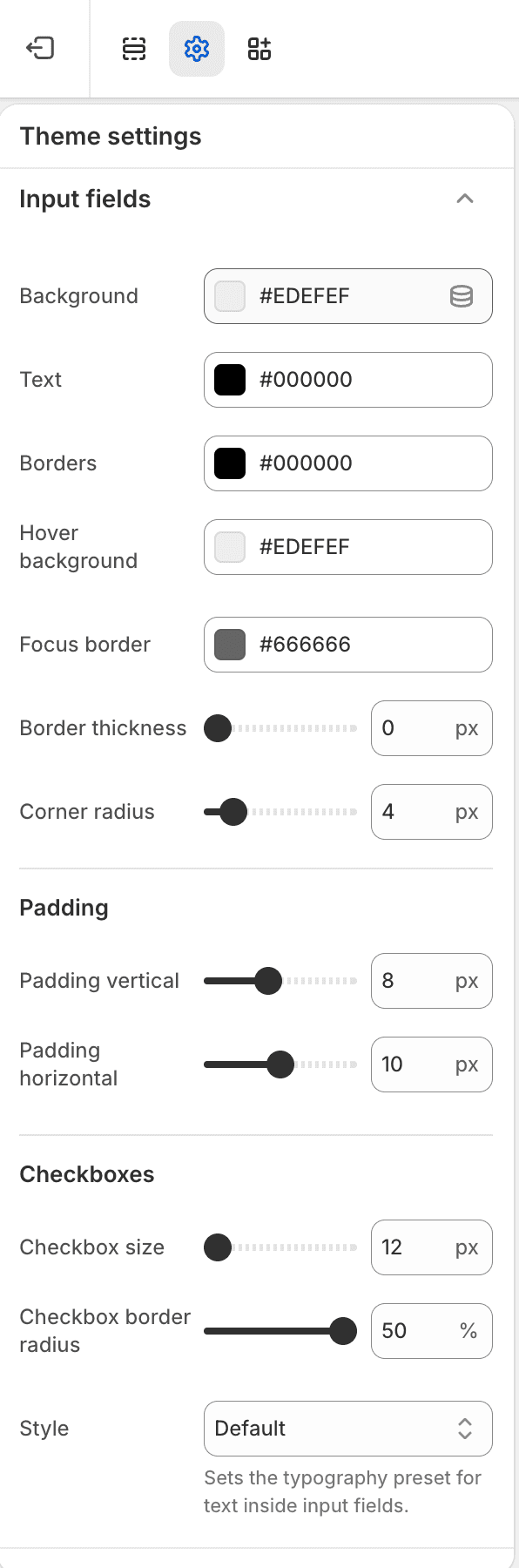
| Area | Settings |
|---|---|
| Colors | Input background, text, border, hover background, and focus border. |
| Shape | Border width and border radius. |
| Padding | Vertical and horizontal field padding. |
| Checkboxes | Checkbox size and radius. |
| Typography | Input text style, optional custom font, size, line height, and letter spacing. |
Publish Checks
- Confirm focus states remain visible after changing input colors.
- Test search, filters, newsletter signup, contact forms, and cart discount entry.