Sections
Sections are reusable page areas that merchants configure in the Shopify theme editor. Use this page to decide whether you are editing a template, adding a section, adjusting blocks inside a section, or changing a global setting that several sections inherit.
Templates, Sections, And Blocks
| Term | What it means | When to use it |
|---|---|---|
| Template | The page layout Shopify uses for a page type such as product, collection, search, cart, blog, article, or page. | Start here when the whole page type or a custom template needs review. |
| Section | A configurable area on a template or section group. Sections can usually be added, removed, reordered, and styled in the theme editor. | Use sections to add content, merchandising, recommendations, search results, forms, or page structure. |
| Block | A smaller configurable item inside a section, such as text, image, button, product item, form field, variant picker, or product-link card. | Use blocks to compose or fine tune the content inside a section. |
Section Types
| Type | Purpose | Examples |
|---|---|---|
| Static sections | Shared storefront areas that usually live in the header, footer, or section groups rather than a single page body. | Header, footer, announcement, and island announcement sections. |
| Content sections | Addable page-building sections for home pages, landing pages, editorial pages, collection storytelling, and promotional content. | Hero Banner, Product Links, Featured Product, Rich Text, FAQ, Showcase, Video, Countdown, and similar content sections. |
| Template sections | Sections tied to a specific template purpose or Shopify data source. | Search page, Search grid mode, Product Recommendations, Complementary products, and Featured blog post. |
How To Choose The Right Section
- Use a template page when the page type itself needs setup, such as Product, Collection, Search, Cart, Blog, Article, or Pages.
- Use a static section when you are editing navigation, announcements, header behavior, footer content, or storefront-wide section groups.
- Use a content section when you are adding a visible page module for storytelling, merchandising, forms, media, or campaign content.
- Use a template section when the section depends on the current product, search query, article, blog, cart, or recommendation data.
- Use a block reference when the section is correct but the item inside it needs configuration.
Section Map
Configure the floating island or traditional header, menus, search, cart, localization, and announcement.
Featured productAdd one focused product purchase section to a page.
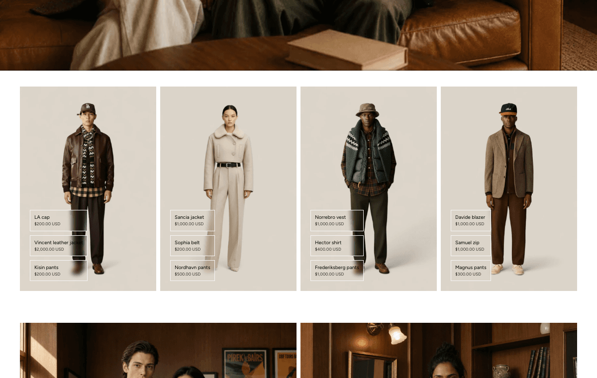
Product linksConfigure Grid, Carousel, Video, Explorer, and Image/Video product-link media from one reference.
Features carouselPresent feature cards in a swipeable carousel with configurable card and navigation controls.
Search pageConfigure the Search mode page experience and drawer behavior.
EmailAdd an inline newsletter signup section with text and email-signup blocks.
Product recommendationsSet expectations for Shopify-powered related products and empty states.
Static Sections
| Section | Purpose | Where it appears |
|---|---|---|
| Header | Navigation, logo, search, cart, account, localization, and header app blocks. | Header section group. |
| Footer | Footer menus, social links, newsletter, policies, and brand content. | Footer section group. |
| Announcement Slider | Rotating or manually controlled announcement messages. | Header or announcement area. |
| Island Announcement | Compact announcement inside the floating island header pattern. | Header area. |
| Announcement Marquee | Scrolling announcement text for high-visibility messages. | Header or page areas where enabled. |
Content Sections
| Section | Purpose | Where it appears |
|---|---|---|
| Hero Banner | First-screen imagery, copy, and actions for home or landing pages. | Home and page templates. |
| Product Links | Shoppable image and video media with linked product cards. | Home, page, collection, and campaign templates. |
| Featured product | One focused product purchase section on a non-product page. | Home, page, collection, and campaign templates. |
| Cards | Modular card grids for features, benefits, links, or storytelling. | Content pages and landing pages. |
| Features carousel | Swipeable feature cards with carousel controls. | Home, page, and collection storytelling. |
| Catalog | Product merchandising through Featured grid or Featured carousel product sections. | Home, collection, and campaign pages. |
| Collection List | Collection links and collection merchandising. | Home, page, and navigation-support pages. |
| Showcase | Flexible rows and columns for mixed content and app blocks. | Landing pages and long-form content pages. |
| Before/After Showcase | Comparison media with a draggable divider. | Product education and campaign pages. |
| Countdown | Timed campaign, launch, or sale messaging. | Home, page, and campaign templates. |
| Hotspot Media Pattern | Interactive media with tagged product or content points. | Editorial and product-discovery pages. |
| Multicolumn image/text | Multi-column image, text, and button layouts. | Brand, page, and campaign content. |
| Rich Text | Simple heading, paragraph, and button content. | Any page that needs text content. |
| FAQ | Accordion questions, product-link media, and support content. | Product education, support, and page templates. |
| Inline newsletter signup. | Home, page, and campaign templates. | |
| Newsletter popup | Popup newsletter capture with configurable content. | Storefront overlay. |
| Divider | Visual separation between content areas. | Any page body where spacing needs structure. |
| Marquee Sections | Scrolling text, image, logo, icon, or divider strips. | Home, page, and campaign templates. |
| Custom Liquid | Store-specific Liquid or embed output. | Any compatible template where custom output is required. |
| Video | Video block usage inside compatible sections, plus product-link video pointers. | Home, page, and campaign templates. |
| Image with Text | Paired image and text storytelling. | Home, page, and editorial templates. |
| Detail Explorer | Accordion rows that reveal supporting media and content. | Product education and campaign pages. |
| Immersive Showcase | Large visual storytelling with product-discovery support. | Campaign and editorial pages. |
| Three Cards Media | Three-column media composition with flexible blocks. | Landing pages and campaign content. |
Template Sections
| Section | Purpose | Where it appears |
|---|---|---|
| Search page | Search-mode content, search input, recently viewed products, and search drawer behavior. | Search template. |
| Search grid mode | Filterable search result grid with product-card blocks. | Search template. |
| Product Recommendations | Related product carousel powered by Shopify recommendations. | Product template. |
| Complementary products | Cross-sell products configured through Shopify Search and Discovery. | Product template. |
| Featured blog post | Highlighted article content for blog or editorial templates. | Blog, article, home, and page templates. |