Theme Settings
Theme settings are the global controls in the Fit Check theme editor gear sidebar. Configure these defaults before tuning template, section, and block settings.
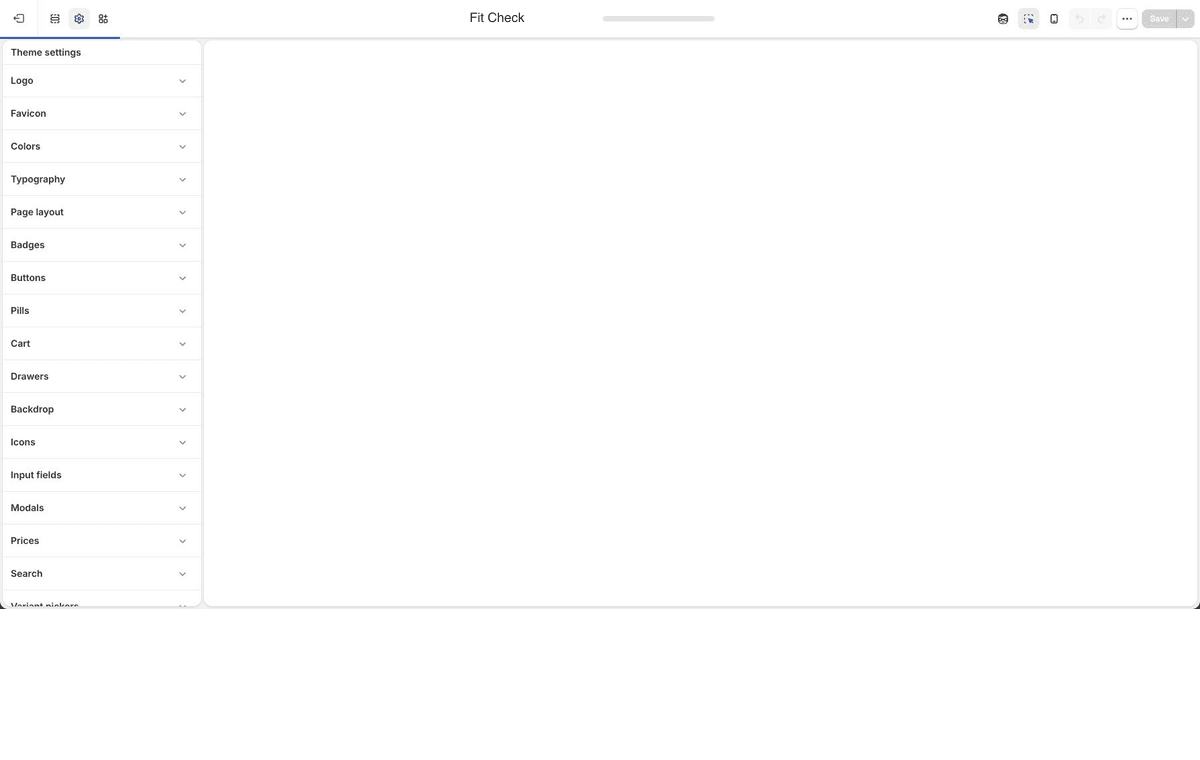
Upload the default logo and inverse logo used by header and contrast-aware surfaces.
FaviconUpload the browser-tab icon for the storefront.
Color paletteSet reusable brand swatches, then use the guide to decide when to reuse palette colors or apply a direct override.
TypographyConfigure page text colors, font slots, paragraph defaults, and H1-H6 presets, then use the guide for setup order.
Page layoutSet page background, border, shadow color, page width, spacing scale, and shadow depth.
BadgesConfigure sale, sold-out, search-result, and custom collection badge appearance.
ButtonsTune Primary, Secondary, and Alternative button colors, typography, borders, radius, and padding.
PillsConfigure pill/tag surfaces used by compact labels and filter-style UI.
CartChoose cart page or drawer behavior and configure cart layout, empty state, notes, discounts, recommendations, and checkout controls.
DrawersSet global drawer colors, borders, shadows, opacity, blur, and padding.
BackdropConfigure the overlay behind drawers and modals.
IconsSet the global stroke width for theme icons.
Input fieldsTune input colors, borders, radius, padding, checkboxes, and input text style.
ModalsConfigure popover, quick-add, and modal panel colors, borders, shadows, opacity, and blur.
PricesChoose currency-code display across product pages, product items, cart items, and cart totals.
SearchChoose header search action, search resources, search drawer text, and quick-add defaults.
Variant pickersConfigure text-option colors, selected variant states, button mode, underline mode, and dropdown appearance.
SwatchesConfigure global swatch variant images, sold-out indicators, size, radius, border, opacity, and gap.
Gift cardUpload the replacement gift-card image used by the gift-card template.
Social mediaAdd social profile URLs used by the Social links footer block.
Full global settings referenceUse the complete reference when you need every global setting group in one place.
Recommended Order
- Set Logo, Favicon, Color palette, Typography, and Page layout first.
- Configure Buttons, Input fields, Badges, Prices, Variant pickers, and Swatches before reviewing product-card and product-form blocks.
- Configure Cart, Drawers, Backdrop, and Modals before testing cart drawer, search drawer, quick add, and popup surfaces.
- Configure Search after deciding whether the header search should open the drawer or navigate to
/search. - Add Gift card and Social media assets before publishing.