Carousel Product Links
A swipeable lookbook carousel for styled product imagery, outfit inspiration, and shoppable media. This section is covered in the consolidated Product Links guide alongside Grid, Video, Explorer, and reusable Image/Video product-link blocks.
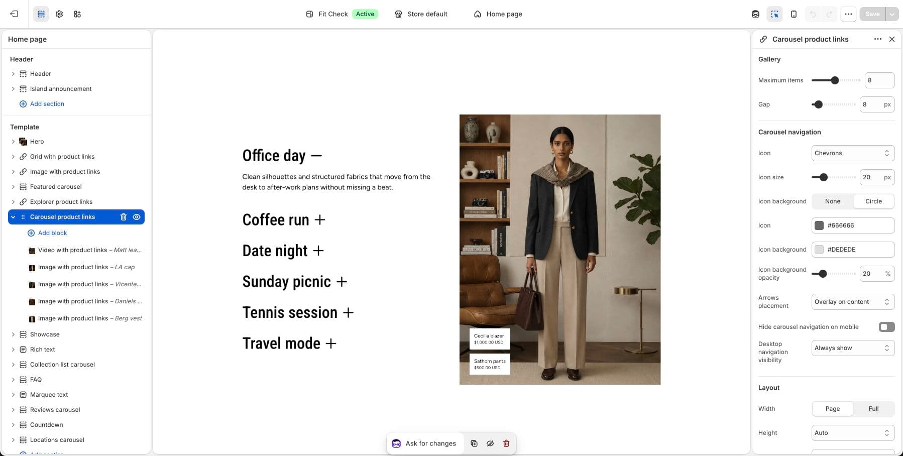
Configure the Section
Use Product Links for setup steps, covered section variants, media block settings, product data guidance, and publish checks.
Section Settings
| Setting | Description |
|---|---|
| Maximum items | Maximum number of carousel items to display. Range: 1-16. Default: 8. |
| Gap | Space between slides. Range: 0-100px. Default: 12px. |
| Width | Page or Full. Default: Page. |
| Height | Auto, Full screen, or Custom. Default: Auto. |
| Height preset | For custom height, choose Small, Medium, Large, or Custom height. |
| Alignment | Horizontal alignment for the carousel content. Default: Center. |
| Position | Vertical position when the section has a fixed height. Default: Center. |
| Background color | Set the section background or leave blank to inherit the global page background. |
| Padding | Use one all-sides value or set top, bottom, left, and right independently. |
Carousel Navigation
| Setting | Description |
|---|---|
| Icon | Choose Chevron, Custom, or None. Default: Chevron. |
| Custom icon | Upload a custom SVG-style icon when the icon setting is set to Custom. |
| Icon size | Size of the navigation icon. Range: 12-48px. Default: 20px. |
| Icon background | Choose None or Circle. Default: Circle. |
| Icon color | Navigation icon color. |
| Icon background color | Navigation background color. Default: #BFBFBF. |
| Icon background opacity | Background opacity for circular navigation controls. Default: 20%. |
| Arrow placement | Place arrows as an overlay on content or below content. Default: Overlay. |
| Hide carousel navigation on mobile | Hide arrow controls on mobile. Default: On for newly added sections. |
| Desktop navigation visibility | Show desktop navigation always or only on hover. Default: Always. |
Blocks
Image with Product Links
Add an image and attach product or custom links. Product links can show product images, prices, card-style styling, hover colors, and up to six linked items.
Video with Product Links
Add a video slide with the same product-link controls. Use autoplay, mute, loop, and controls settings to match the surrounding page experience.
Tips
- Use consistent image or video aspect ratios across slides for the cleanest carousel rhythm.
- Keep product links concise so they stay readable over media.
- Leave mobile navigation hidden when the carousel is mostly gesture-driven, and show it when slide controls are important for the page.